Why Is My Website Not Converting? 9 Things to Check First
A polished website can attract visitors and still generate too few enquiries, sign-ups, bookings, or sales. If you are asking why is my website not converting, do not begin with button colours or a redesign. Trace the journey: what visitors expected, what they understand, why they should trust the offer, and whether they can complete the next step. The problem may sit on one page, across several steps, in the traffic, or in the tracking.
Quick answer: Your website may attract the wrong visitors, present an unclear offer, hide the next action, provide too little evidence, break the promise made before the click, or create a difficult conversion path. Mobile, form, performance, technical, and analytics issues can also block a conversion—or leave it unrecorded.

9 Reasons Your Website Is Not Converting
The nine checks below cover the most common places where a conversion journey can break. Treat them as diagnostic hypotheses rather than confirmed causes: review each one against your website, then use analytics, user behaviour, and customer feedback to validate what is affecting conversions. Start with anything that prevents visitors from understanding the offer or completing the intended action.
1. Your offer is not immediately clear
Visitors should quickly understand what you offer, who it is for, the problem it solves, and what the customer receives.
Test the first impression with someone outside the business. Ask:
- What does this company offer?
- Who is it for?
- What outcome would you expect?
Vague answers suggest that the value proposition may be a conversion blocker.
2. The wrong people are reaching the page
A website may work for its audience but attract visitors who were never likely to convert. Check whether search intent, ad targeting, referral context, and pre-click wording match the offer.
Content for people seeking a free DIY solution may send traffic to a high-touch consulting service. Compare results by source and landing page before blaming the site.
3. Visitors cannot see what to do next
Each commercial page needs a clear primary action. Check whether the CTA is easy to identify, fits the page purpose, explains the next step, and appears when the visitor has enough information to act.
“Learn More” may be too vague when users expect to start a free assessment. The real question is whether the action is understandable and timely.
4. Your claims are not supported by enough evidence
A promise says what you can do; evidence helps visitors believe it. Useful proof may include specific testimonials, contextual results, case studies, credentials, transparent company information, demonstrations, or risk-reduction details.
Generic praise, unexplained badges, and logo walls do not automatically create trust. Can a cautious buyer verify key claims and identify the company?
5. The page does not match the visitor’s expectation
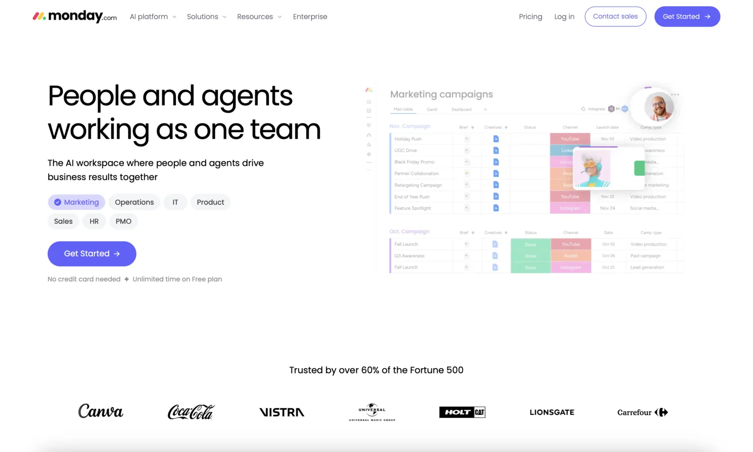
Keep the message consistent from the first promise to the next step. Compare the search result, ad, referral link, or CTA with the page headline, offer details, and click destination.
If an ad promises “instant pricing” but the page only offers “Book a call,” the expected trail has broken. Check major entry points separately.
6. The information is difficult to find or process
Review the page as a decision-making task. Look for unclear navigation, buried details, weak hierarchy, long unstructured blocks, and repeated or conflicting information.
Identify the questions a visitor must answer before acting, then check whether those answers are easy to find and understand.
7. The conversion path contains too much friction
Follow the complete route rather than reviewing only the landing page:
Entry point → CTA → intermediate page or modal → form, booking, or checkout → confirmation
Check for unnecessary steps, unexpected destinations, repeated questions, dead ends, unclear errors, lost context, and missing confirmation. A service CTA opening a generic contact form may force visitors to explain their selection. A conversion path audit reveals problems that page reviews miss.
8. The form asks for too much or creates uncertainty
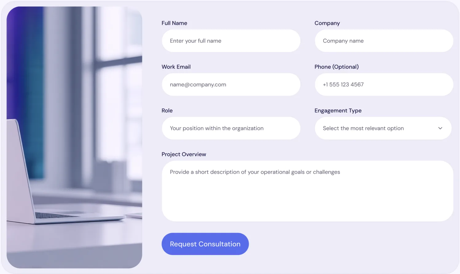
There is no universal maximum number of fields; appropriate effort depends on the action. But each request should have a reason.
Check whether visitors know why data is needed, what happens after submission, and when to expect a response. Test required fields, invalid formats, errors, and corrections; one mistake should not erase completed work. Add relevant privacy cues.
Asking for budget, phone, team size, and a detailed brief before explaining the next step creates uncertainty.
9. Mobile, performance, or technical issues block the action
Test real mobile screen sizes and more than one browser where possible. Check tap targets, overlays, unstable layouts, slow interactions, broken links, failed submissions, and inaccessible controls.
Separate two problems:
- The user cannot complete the action. A button fails, a field is unusable, or confirmation never appears.
- The action succeeds but is not recorded. Conversion tracking is missing, duplicated, or attached to the wrong event.
The second can make a working site appear to have a low website conversion rate. Compare analytics with actual enquiries, bookings, or transactions.
What should you fix first?
Use this practical order:
- Broken paths and technical blockers.
- An unclear offer or poor message match.
- A missing or confusing primary action.
- Trust and risk concerns near the decision.
- Secondary design and copy improvements.
Then consider impact, prevalence, and repair effort. A broken booking button matters more than a typography inconsistency. Do not redesign until you know whether the problems are local or systemic.
Quick website conversion checklist
Answer Yes, Not sure, or No:
Can a new visitor understand the offer, audience, and benefit?
- Yes
- Not sure
- No
Do visitors arrive with relevant intent and expectations?
- Yes
- Not sure
- No
Is the primary next action clear and appropriate?
- Yes
- Not sure
- No
Are important claims supported by credible evidence?
- Yes
- Not sure
- No
Does the page fulfil the promise made before the click?
- Yes
- Not sure
- No
Is decision-critical information easy to find and process?
- Yes
- Not sure
- No
Does the full conversion path remain clear and connected?
- Yes
- Not sure
- No
Does the form request appropriate information and handle errors well?
- Yes
- Not sure
- No
Can users complete the action on mobile, and is it tracked correctly?
- Yes
- Not sure
- No
Mostly Yes suggests few obvious on-page issues, although behavioural or traffic data may still be needed.
Several Not sure answers call for a systematic website conversion audit.
Several No answers show where to start: fix failures that block understanding, trust, or action.
Do you need a full website redesign?
Usually, no. Messaging, proof, CTA, and form issues can often be corrected independently.
Redesign may be justified for systemic problems such as weak structure, an unsuitable technical foundation, or repeated usability failures. Diagnose the scope first.
Conclusion
Do not guess from one page or metric. Check the journey from the first expectation to the completed action, fix serious blockers first, then use real data to see what changed.
Frequently asked questions
How do I find out why my website is not converting?
Review the offer, audience fit, CTA, evidence, message match, conversion path, forms, mobile experience, technical behaviour, and tracking. Add traffic and behavioural data where available.
Can a website have traffic but still fail to generate leads?
Yes. Visitors may have the wrong intent, encounter an unclear offer, lack trust, or face friction. Traffic volume alone does not show whether the right people can and want to convert.
What is a good website conversion rate?
There is no universal good rate. A useful target depends on the conversion, audience, traffic source, price, buying stage, and business model. Compare equivalent journeys against your own reliable baseline.
Do I need to redesign a website with a low conversion rate?
Not necessarily. Targeted changes may solve messaging, proof, CTA, or form issues. A redesign is more appropriate when structural, technical, or repeated usability failures affect the wider site.