Does Your Website Look AI-Generated? A Genericity Risk Test
Some websites feel AI-generated even when every word was written by a person. Others use AI throughout the process yet still communicate a specific, credible business. The visible result-not the production method-is what matters.
An AI-generated website cannot be reliably identified from appearance alone. What you can assess is genericity risk: whether the site feels interchangeable, makes broad claims without evidence or fails to reflect the actual business behind it.
This article uses three practical experiments to answer a more useful question:

Could this website belong to almost anyone in its category, or does it communicate a real and recognisable business?
AI use is not the problem being tested
Three ideas are often confused:
- AI-assisted production is how the site, copy or visual was made.
- Generic output is an observable quality of the finished result.
- Genericity risk is the risk that a site does not provide enough business-specific meaning for visitors to understand, compare or trust it.
A human-written website can be generic. A template can be thoroughly adapted. An AI website builder can produce a useful result when it is grounded in real source material and carefully reviewed.
Familiar interaction patterns are not the problem either. Clear navigation, standard form controls and recognisable checkout flows reduce unnecessary effort. The useful formula is simple:
Familiar interaction patterns + business-specific meaning = useful clarity.
Experiment One: The Swap Test
Open the homepage, a main service or product page, the About page and one conversion page. Temporarily imagine removing the company name, logo, product name and client logos.
Then ask: Could the remaining content belong to three competitors without meaningful changes?
Use a fictional B2B automation agency as an example:
We empower businesses with innovative solutions that streamline workflows, boost efficiency and drive sustainable growth.
The statement is not necessarily false. But it could describe a software company, consultancy, accounting firm or digital agency. It gives no clear audience, workflow, delivery model or reason to choose this business.
What survives after the brand name disappears?
Look for details that remain meaningful without the logo:
- a defined audience or business context;
- a named problem or workflow;
- a real service model;
- systems, industries or use cases;
- relevant constraints;
- a recognisable point of view;
- a specific outcome;
- supporting proof.
Words such as innovation, growth, efficiency, tailored and future-ready do not reveal AI authorship. They become generic marketing language when they replace the business-specific layer instead of supporting it.
For the automation agency, a more informative direction might be:
We design and maintain HubSpot, Slack and finance-workflow automations for B2B service teams that have outgrown manual client operations.
That sentence is not meant as a universal copy formula. It simply gives the reader something tangible: who the work is for, what kind of work is involved and where it happens.
Run the visual version of the Swap Test
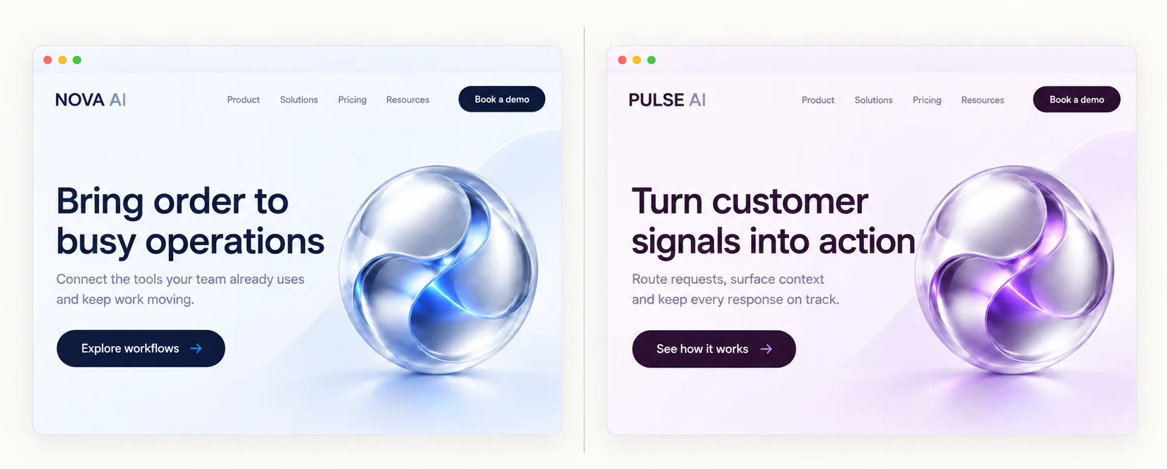
Repeat the exercise with imagery. Could a stock photograph, abstract 3D object, gradient or generic dashboard mock-up move to a competitor’s website without losing meaning?
A visual does not have to show the product literally. It should, however, help the visitor understand a use case, process, people, work or outcome-or deliberately remain secondary to strong explanatory content.
An abstract robot image above the automation agency’s claim adds an AI association but says little about how the company works. A product workflow, annotated integration view or a relevant operational scene can contribute more context.
Experiment Two: The Proof Test
Choose the five strongest claims on the website. For each one, ask:
- What exactly is being claimed?
- What observable detail supports it?
- Is the evidence relevant to this claim and offer?
- Can a visitor interpret the evidence without insider knowledge?
- Is essential context missing?
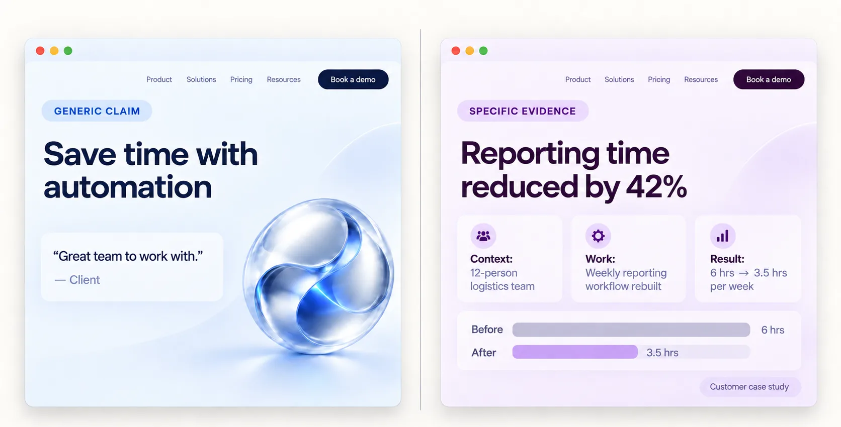
Claims that sound specific but are not
Polished wording can appear precise without offering meaningful proof. Common examples include:
- Trusted by leading companies without identifiable client context;
- Award-winning without naming the award;
- Proven results without a method, case or outcome;
- a number without its source, scope or denominator;
- a testimonial about friendly communication placed beside a claim about financial performance;
- a product image that does not depict a real product state.
Consider this revised agency claim:
We automate your operations using an intelligent, tailored approach.
It is more elaborate than a slogan, but it still leaves the visitor asking: which operations, for whom, using which systems and through what process?
Specificity comes from material detail, not decorative precision. A stronger supporting section might explain the workflows the agency handles, the type of teams it works with, the integrations it configures and a documented result with appropriate context.
Separate detail from evidence
A detail becomes evidence only when it supports a decision-relevant claim.
For example, a testimonial saying "They were responsive and great to work with" may support a claim about communication. It does not establish that the agency reduced reporting time or improved process reliability.
Likewise, a long list of tools can demonstrate familiarity, but not automatically a successful delivery model.
This does not mean every page needs metrics, logo walls and case studies. It means important promises should have appropriate support. For a focused review of claim-to-proof relationships, see Website Trust Signals.
Experiment Three: The Consistency Test
Open several important pages side by side:
- homepage;
- main service or product page;
- About page;
- case study or portfolio page;
- contact or conversion page.
Now follow the same offer across them. Do they feel like parts of one business?
Listen for changes in voice
Notice abrupt shifts between corporate, playful and highly technical language. Look for different names for the same service, changing audience definitions, repeated slogans that add no new information or inconsistencies in pricing, scope and process.
Different page types can use different tones. A case study may be more detailed than a homepage, while a contact page may be more direct. The central offer and the reader’s expectations should still remain coherent.
A consultant whose service pages all promise strategic growth but describe unrelated processes on each page may have a content-governance problem, not an AI problem. To a visitor, however, the result can still feel assembled rather than deliberate.
Follow the offer, not just the words
Consistency involves the whole path:
hero promise → service explanation → CTA → form or booking step → confirmation
Imagine that the homepage presents fast, self-service automation packages. The CTA then opens an open-ended consulting enquiry form requesting a detailed project brief, with no package context. The message, visual style and button may all look polished, but the site is not maintaining a consistent offer journey.
This does not prove anything about authorship. It shows that the business-specific meaning was not carried through the site. For a wider first-page review, use the Homepage Audit Checklist.
Look for reality gaps
Genericity risk increases when the site contains details that seem disconnected from the real business:
- non-functional buttons;
- placeholder content;
- testimonials with no usable context;
- inconsistent people, job titles or company names;
- results that appear impossible or unsupported;
- screenshots that do not match the described product;
- features that do not exist;
- outdated company, legal, pricing or process information.
Do not automatically call these hallucinations. They may be maintenance, editorial or operational issues. The question is whether a prospective customer can rely on the site as a representation of the business.
False positives: familiar does not mean generic
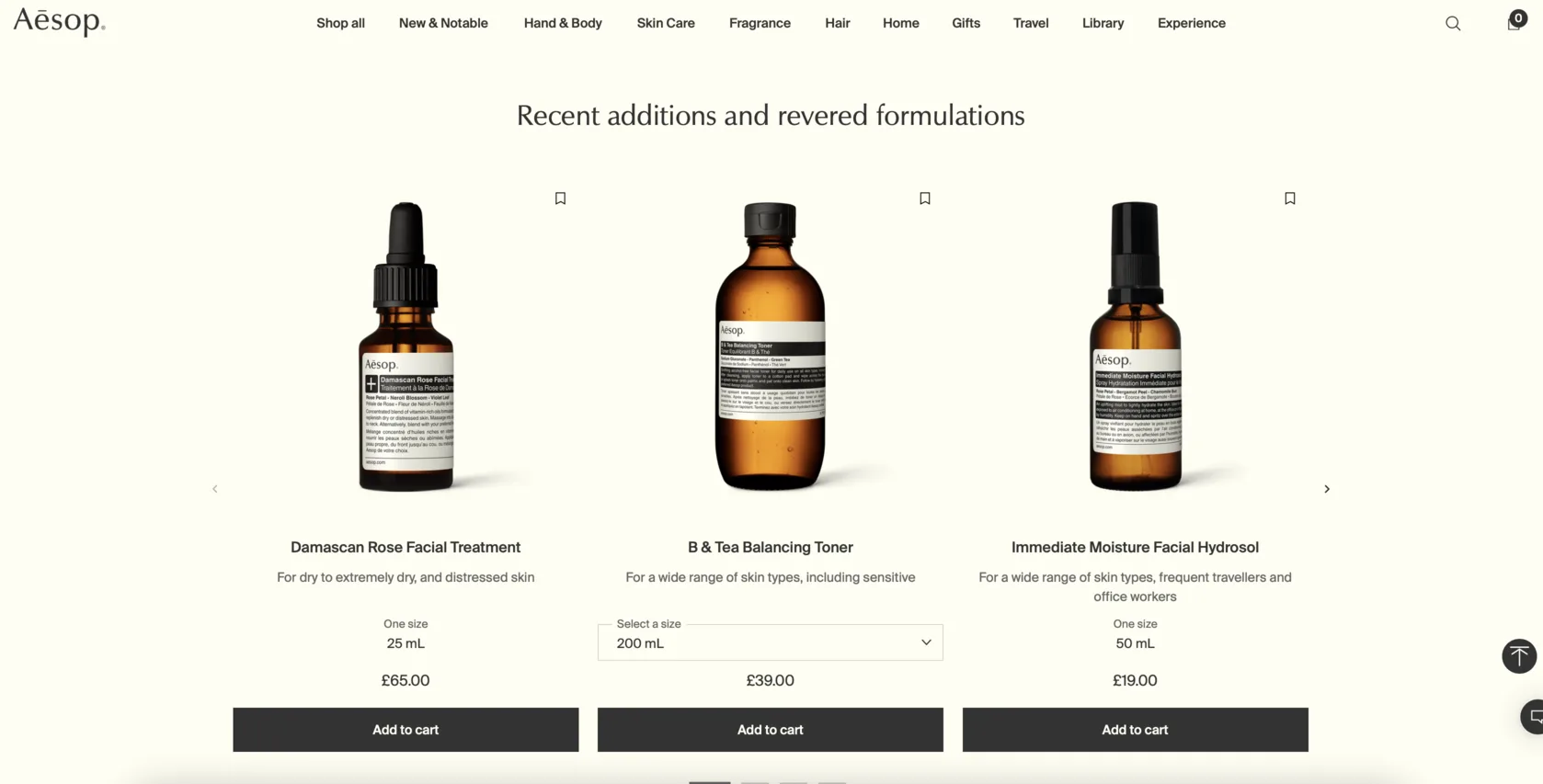
Conventional layouts
A familiar homepage structure can make a site easier to use. Originality is not a requirement for clarity.
Minimal copy
A short message may be sufficient for a known brand, a familiar product category or a focused campaign. It becomes a problem only when the reader cannot identify the offer or relevance.
Templates
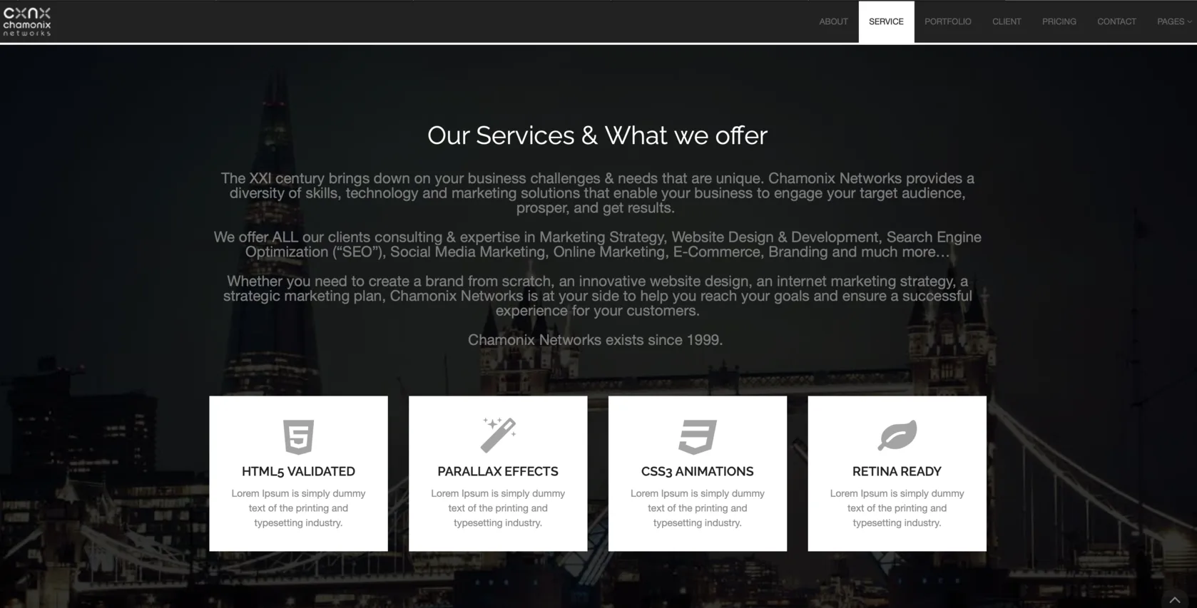
Using a template does not make a website generic. Leaving its stock structure, placeholder logic and category-neutral language mostly unchanged can.
Stock or abstract imagery
These visuals can work as supporting material when the rest of the page communicates the business clearly. They create risk when they become the only available explanation.
Category terminology
Clear industry terms help visitors understand a service and can support search relevance. Replacing them with unusual synonyms merely to sound distinctive often makes the site less understandable.
Rebuild specificity from source material
Do not start by asking an AI tool to make the copy "more human" or "less generic." Start with information the business can actually stand behind.
Create a small specificity source pack for one priority page:
- real customer questions;
- common sales objections;
- product screenshots;
- process steps;
- service constraints;
- pricing logic;
- delivery expectations;
- client language;
- before-and-after examples;
- case-study notes;
- situations where the offer is not a fit.
Then replace one vague claim at a time with meaningful source material.
For the automation agency, the source pack might reveal that it works only with service firms using HubSpot and Slack, starts with a process audit and does not build custom software. Those details narrow the audience, clarify the service and make the next action more credible.
Do not make copy stranger to make it feel human
Avoid superficial fixes such as forced humour, random metaphors, unusual synonyms, deliberate grammar mistakes or emotional language unrelated to the brand.
The goal is not to hide AI use. It is to make the website more accurate, useful and identifiable.
Genericity risk card
Review the site across four layers. Do not turn the result into an AI-detection score.
Meaning
Can visitors identify the specific offer, audience, problem and context?
Evidence
Are material claims supported by relevant details, examples or proof?
Visuals
Do images help explain the product, process, people or use case?
Consistency
Do offer, terminology, voice and expectations remain coherent across pages?
Use these qualitative outcomes:
- Business-specific: the site contains enough concrete, consistent signals to represent a recognisable business.
- Category-level: the site explains the industry but only weakly distinguishes the company.
- Interchangeable: replacing the name and logo would leave most of the content intact.
What to fix first
Start with the interchangeable core message. Then support important claims with material evidence. Next, align visuals and connected pages with the offer. Tone and visual polish should follow once the business meaning is in place.
A new gradient, a less formal tone or a more unusual layout cannot compensate for missing specifics.
The goal is not to hide the tool
Visitors rarely need to know which tool helped produce a website. They need to understand what the business does, whether it is relevant to their situation and why its claims deserve attention.
AI, templates and familiar UX patterns can all support that goal. Genericity risk falls when a site uses concrete context, relevant proof and a coherent offer across its pages. Test the visible result rather than trying to infer its origin: does this website communicate a real business, or only a polished version of its category?