Contact Form Audit: What Stops Visitors from Submitting?
A visitor has understood the offer, decided to make contact and reached the form. Yet the enquiry may still fail because the request feels disproportionate, a field is confusing, validation blocks correction or the submission never reaches the business.
This contact form audit follows that journey from the visitor’s initial expectation to confirmed delivery. You will complete the form, deliberately trigger safe errors and trace the result beyond the success message. The aim is not to make every form shorter. It is to distinguish necessary qualification from avoidable effort, uncertainty and technical failure.

Test the form responsibly
Use a staging environment when one is available. On a production website, clearly label the entry as a test and notify whoever receives enquiries. Do not use another person’s information or submit sensitive data.
Avoid testing payments, binding bookings or actions with irreversible consequences unless you have a dedicated safe procedure.
Stage one: Before typing anything
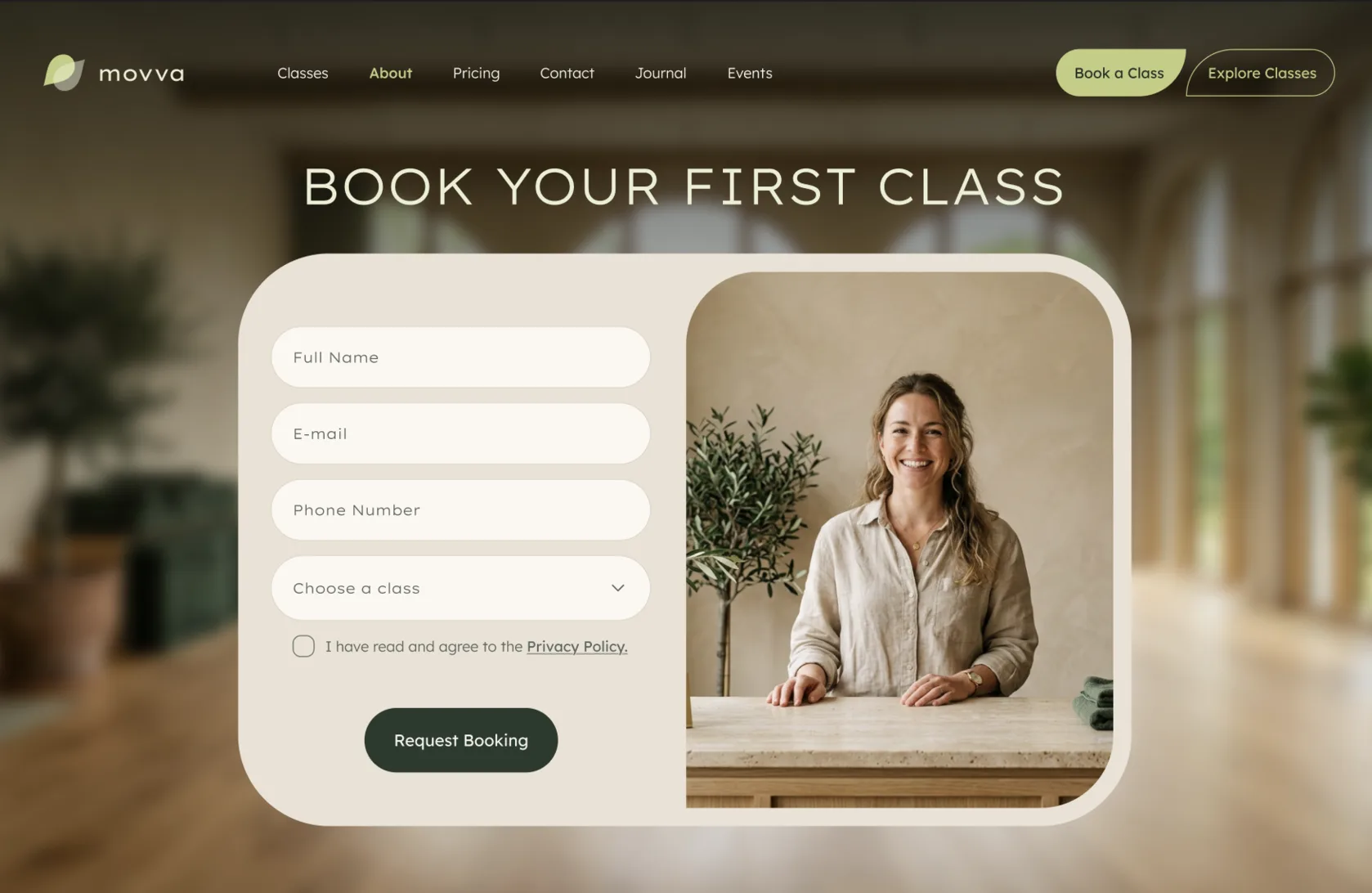
Open the website contact form, but do not complete it yet. Note what the page asks you to give and what it promises in return.
Is the exchange understandable?
A form is an exchange of time, attention and personal information for an expected outcome. Before entering anything, a visitor should be able to determine:
- what the form is for;
- which requests belong there;
- what will happen after submission;
- who is likely to respond;
- when a response can reasonably be expected;
- whether another channel exists for support or urgent enquiries.
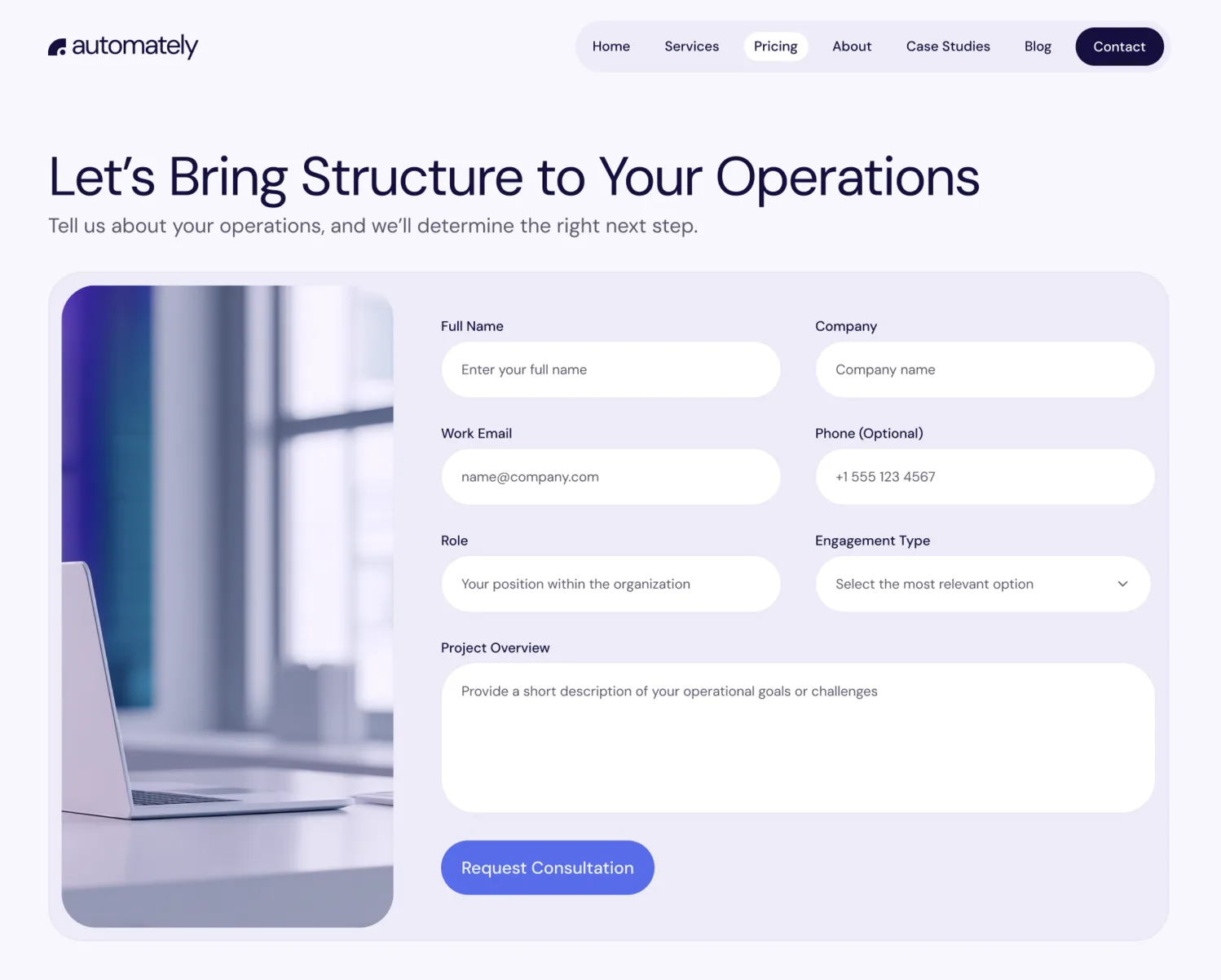
Tell us about your project does not reveal whether the visitor will receive an estimate, an introductory call or a general email response. A short sentence such as We will review your requirements and reply within two business days makes the exchange more concrete without promising an immediate solution.
Did the journey create the right expectation?
Compare the CTA that opened the form with its heading, introductory text, requested information and stated outcome.
A Get a quick quote button creates a different expectation from Request a project consultation. If the first leads to a form demanding a detailed brief, budget documents and a mandatory call booking, the visitor encounters a different commitment from the one advertised.
This is not a full CTA review. You are checking only whether the promise made before the form continues into the form itself. A wider evaluation belongs in the Website CTA Checklist.
Is important data context available?
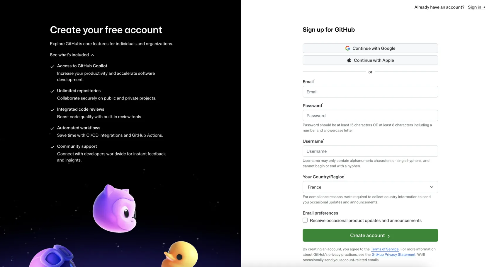
Look for an understandable explanation of how submitted information will be used and a visible route to relevant privacy information. Sensitive requests deserve more context than an email field used to send a reply.
A mandatory phone number, for example, may make someone expect an unwanted call when the page does not explain the follow-up process. Marketing consent should not be hidden inside an unrelated agreement or expressed through a vague pre-selected option.
Exact privacy and consent requirements depend on the data, purpose and jurisdiction. This audit checks whether the request is understandable; it is not legal advice. Related credibility issues can be examined in the Website Trust Signals guide.
Stage two: Complete the form like a real visitor
Complete the form once with realistic test data. Repeat the exercise on a real phone, paying attention to effort rather than speed.
Build a field friction ledger
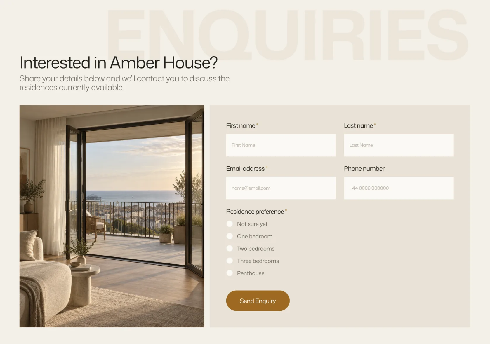
List every visible and conditional field. Then record why the business needs it at this stage and what the visitor must do or disclose to answer it.
| Field | Required? | Why is it needed now? | Visitor effort or concern | Decision |
|---|---|---|---|---|
| Yes | Needed to reply | Low when the purpose is clear | Keep | |
| Phone number | Yes | Not explained | May imply an unwanted call | Explain, make optional or defer |
| Detailed project brief | Yes | Used for qualification | High effort before trust is established | Shorten or defer |
| Budget | Yes | Helps assess fit | Sensitive without pricing context | Explain or use ranges |
Use four possible decisions:
- Keep: the information is necessary at this point.
- Explain: the purpose is legitimate but not obvious.
- Defer: the business needs it later, after initial contact.
- Remove: the information is unused, duplicated or unrelated.
Required fields need a real operational purpose, but optional fields are not free of friction. They still add reading, decisions and uncertainty. Conversely, a longer lead generation form may be justified when qualification protects both the visitor’s and the company’s time.
The objective is not the highest possible number of submissions. It is an appropriate exchange for the type of enquiry the business wants to receive.
Notice the decisions hidden inside each field
As you complete the form, observe whether:
- labels remain visible after you start typing;
- required and optional fields are distinguishable;
- expected formats appear before an error occurs;
- related fields are grouped logically;
- choices are understandable and do not overlap;
- defaults avoid silently misrepresenting the answer;
- conditional fields appear only when relevant;
- the same information is not requested twice;
- browser autofill works where appropriate;
- the mobile keyboard matches the expected input;
- text areas provide enough working space;
- file types and size limits are stated before upload.
Placeholder text can demonstrate an answer, but it should not be the only label if it disappears during input.
On mobile, an email field should open a suitable keyboard, and a long project description should not be confined to an impractically small box. These are observable interaction problems; whether they materially affect completion requires behavioral data.
For a broader device-level review beyond the form itself, use the Mobile Conversion Checklist.
Stage three: Break the form on purpose
Now run a controlled failure test:
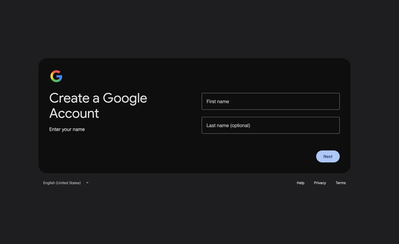
- Leave one required field empty and try to continue.
- Enter an invalid email format.
- Try an unexpected phone format if the form requests a number.
- Exceed a stated character or file limit.
- Correct each error and submit again.
Use ordinary invalid values only. This is a form validation UX test, not a security or load test.
Watch how the form supports recovery
An error should help the visitor locate and correct the problem without destroying completed work.
Check whether the response:
- appears near the relevant field;
- explains what needs to change;
- makes the invalid field identifiable visually and by keyboard;
- moves focus predictably when appropriate;
- preserves valid information already entered;
- remains available long enough to understand;
- clears or updates after correction;
- accepts the corrected value.
Invalid input identifies a problem but offers little help. Enter an email in the format name@example.com provides a correction path.
Also test what happens after more than one error. A form that clears a detailed brief because the phone number has the wrong format turns a small correction into repeated work.
Check the cost of anti-spam protection
CAPTCHA, email verification, honeypots, rate limits and blocked domains may protect the business from abuse. They can also obstruct legitimate enquiries when the challenge fails, the instructions are unclear or a valid address is rejected.
The right protection depends on the form’s risk and spam volume. Record observable barriers without assuming that every CAPTCHA is harmful or that invisible protection is sufficient.
Stage four: Press Submit and follow the result
A contact form audit is incomplete if it ends when the button is pressed. Submit your labelled test entry and follow what happens on both sides.
Observe the sending state
During processing, check whether the interface communicates that something is happening. The button may change, a loading state may appear or the form may provide another clear signal.
The specific animation is unimportant. The visitor should not need to guess whether the click worked.
Verify that:
- repeated clicks do not create accidental duplicate submissions;
- entered content remains until success is confirmed;
- network or server failure produces a recoverable state;
- another attempt can be made safely.
A frozen button and an unchanged form can encourage repeated clicks. Removing all entered data before the server confirms receipt creates a more serious loss.
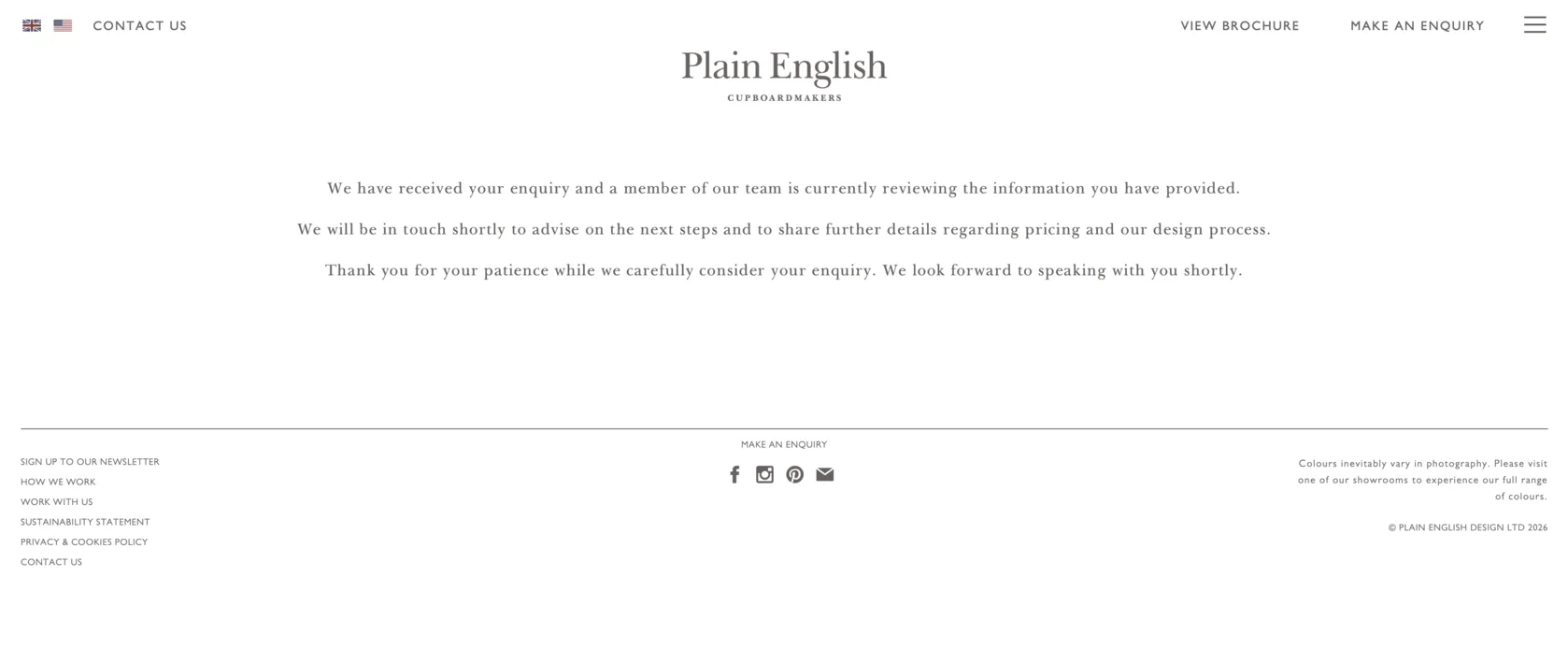
Is success unmistakable?
The confirmation should clearly state that the enquiry was received and explain the expected next step.
Thanks! acknowledges something, but it does not clarify whether the request was submitted successfully or when anyone will respond. A useful confirmation might repeat the enquiry type, provide a response window and offer a reference number, booking link or appropriate next resource.
The completed form should not simply reappear empty while leaving visitors unsure whether they need to submit it again.
Verify that the lead actually arrives
Trace the operational path:
form → submission endpoint → email or CRM → notification → assigned owner
Confirm that the test entry appears in the expected system and that:
- every field has been preserved;
- long messages are not truncated;
- consent and source information are passed correctly;
- the responsible person receives a notification;
- the email has not landed in spam;
- the team can identify the originating page;
- the conversion event is recorded when tracking is configured.
Keep three outcomes separate:
- The visitor cannot submit the form.
- The visitor sees a success message, but the lead is not delivered.
- The lead arrives, but analytics does not record the conversion.
The first is an interaction failure. The second is an operational loss. The third corrupts measurement but does not mean the enquiry disappeared. The wider journey from CTA to business response can later be examined through a Conversion Path Audit.
Record the audit by stage
Use this record to preserve what happened and what needs investigation:
| Stage | What you tested | Result | Severity | Next action |
|---|---|---|---|---|
| Before typing | Purpose and next-step expectation | Clear / unclear | — | — |
| Completing | Field burden and mobile input | Pass / issue | — | — |
| Error recovery | Validation and correction | Pass / issue | — | — |
| Submission | Loading and duplicate prevention | Pass / issue | — | — |
| Confirmation | Success and next steps | Pass / issue | — | — |
| Delivery | Email, CRM and tracking | Pass / issue | — | — |
For severity, choose the description that matches the evidence:
- Blocks submission
- May create avoidable friction
- Creates uncertainty
- Needs behavioral data to assess
- No issue found
Do not convert the record into a numerical score. A broken submission endpoint and an unexplained optional field are not equivalent problems.
Different forms justify different levels of effort
A simple contact request
Usually needs only enough information to understand the request and send a reply.
A qualified project enquiry
Budget, timeline and scope may be reasonable when the visitor understands how they will be used and what happens next.
A support form
Product, account and issue details may be necessary for routing, but the form should not present itself as a general sales contact.
A booking or application flow
A longer or multi-step process may be appropriate when requirements, progress and commitment are clear before the visitor begins.
Form length alone is not a useful verdict. Compare the requested effort with the value, complexity and stage of the interaction.
The form is not finished at Submit
A form can create avoidable friction, but the number of fields is only one part of the diagnosis. A useful audit begins with the promise that brought the visitor to the form and ends only when the enquiry has reached the correct system.
Fix observed blockers, data loss and misleading states first. Then address requests that appear disproportionate or unexplained. Once the form works reliably, behavioral data can help determine where further changes are worth testing—without treating every incomplete submission as proof of the visitor’s motive.