Website CTA Checklist: Audit the Next Step, Not Just the Button
A visible button is not necessarily a useful call to action. Visitors may notice it but still hesitate because the action feels premature, the label is vague or the next page does not match what was promised.
This website CTA checklist helps you examine the complete connection between the page, the proposed action and what happens after the click. Use it across important entry pages rather than evaluating one button in isolation.

In short: what makes a CTA work?
An effective CTA matches the visitor’s likely intent, supports the purpose of the page and describes a relevant next step. It is visually identifiable without overwhelming other options, appears after enough decision information and leads somewhere predictable. It must also remain usable across devices and preserve the context established before the click.
Map the action before judging the button
A CTA is any element that directs visitors toward a meaningful next step. It may be a button, text link, booking prompt, phone number, form action, product control or navigation link.
A primary CTA supports the main outcome of the page. A secondary CTA offers another appropriate path, often for visitors who are not ready for the primary action.
Before starting the call to action audit, record four things for each important page:
- the page’s purpose;
- the visitor’s likely stage of decision-making;
- the intended primary action;
- the destination or result of that action.
For example, the purpose of a service page may be to help visitors evaluate one service. Its primary action could be Request a proposal, while View related work provides a lower-commitment secondary path.
Not every page needs an immediate sales action. An article may lead to another resource, a comparison or a practical tool.
Run the CTA audit in three passes
Do not inspect only the hero or the most colourful button. Follow important calls to action across your homepage, service pages, product pages, pricing pages and other common entry points.
The first pass checks whether the proposed decision makes sense. The second examines how the action is presented. The third follows the visitor beyond the click. Any issue you find is a diagnostic signal, not proof that it caused a particular conversion result.
Pass 1: Check the decision
1. Define the next useful step
Start with what the page should help the visitor do. The action should continue the purpose of the page instead of introducing an unrelated or premature request.
A pricing page might lead to plan selection or a tailored quote. A case study might connect to the featured service. An educational article does not necessarily need to push readers directly into a sales call.
Ask:
- What decision is this page helping someone make?
- What would be a logical next step after reading it?
- Does the current CTA support that step?
When evaluating CTAs on the homepage, consider its wider role in introducing and routing visitors.
2. Match the commitment to visitor readiness
Compare what visitors know at this point with what the CTA asks them to do.
Someone exploring a complex service may not be ready to Book a call immediately. They may first need to understand the process, compare options or see relevant work. A lower-commitment secondary CTA can support that stage without replacing the commercial path.
The issue is not that high-commitment actions are inherently wrong. The issue is asking for commitment before the page has created a reasonable basis for it.
3. Check what visitors know before they act
Before an important action, visitors may need pricing context, eligibility information, process details, examples, evidence or an explanation of what happens next.
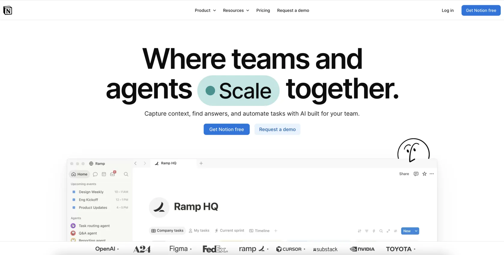
Place decision information near the action it supports. Beside Start free trial, whether a credit card is required may matter more than an unrelated client logo wall.
Do not add trust elements mechanically. Identify the uncertainty created by the specific action and provide information that addresses it.
Pass 2: Inspect how the action is presented
4. Find the primary action without reading every word
Step back from the page and identify which element appears to be the main next step. It should be distinguishable from body text, decorative elements and lower-priority links.
This does not require one universal button colour, shape or placement. Visual treatment should reflect priority and remain understandable at different screen sizes.
A CTA does not always need to appear above the fold. It should appear when enough context exists—and remain available when the visitor is ready to act.
5. Read the label as a promise
CTA button text should help visitors predict the immediate result.
Learn more may be sufficient when the surrounding section makes the destination obvious. View pricing describes a specific destination. Book a consultation describes a particular commitment.
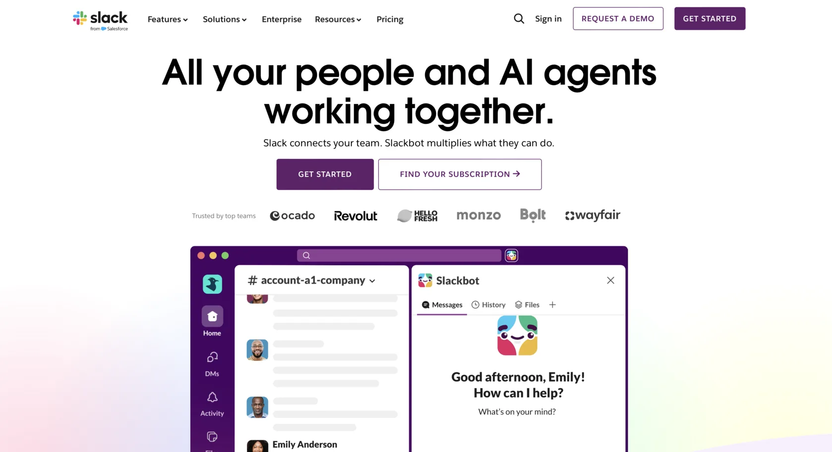
Get started becomes ambiguous when it could lead to registration, payment, a booking calendar or a free website check.
Read each label together with its surrounding copy, then compare it with what actually happens next. Avoid artificial urgency words unless the urgency is genuine.
6. Rank competing actions
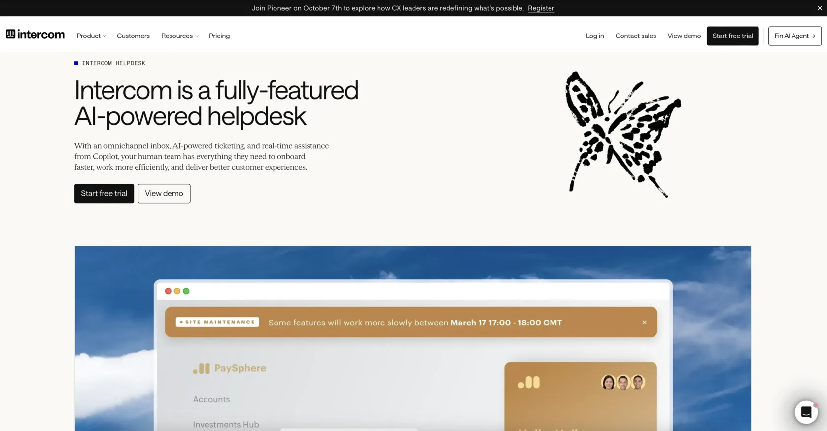
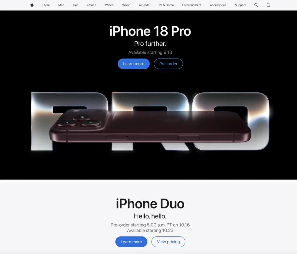
Several CTAs can coexist when their roles are clear. Confusion begins when incompatible actions receive equal prominence or their relationship is unexplained.
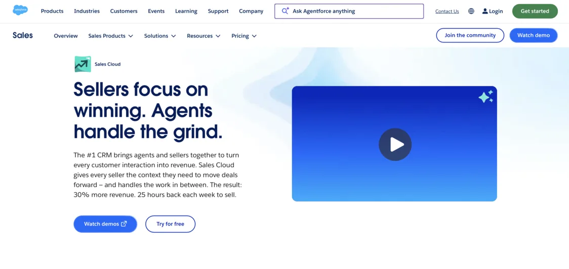
Consider a hero containing three identical buttons:
- Book a call
- Explore services
- Download guide
They represent different levels of commitment, but their presentation offers no priority. Choose the action that best supports the page, then give alternatives proportionate visual weight.
Also check whether multiple labels describe the same destination. Unnecessary variation can make one action appear to be several different choices.
Pass 3: Follow the click
7. Compare the destination with the promise
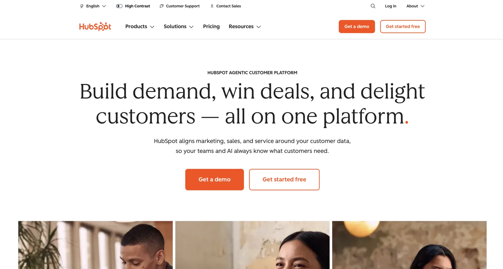
Select every important CTA and inspect the next screen. The destination should continue the expectation created before the click.
If View pricing opens a contact form without any prices, the path breaks its promise. Similar mismatches include an unexpected account requirement, payment step, download or sales call.
Check whether the next heading reflects the selected action and whether the offer, product or service remains recognisable. This continuity is sometimes called a scent trail: each step signals that the visitor is still following the expected path.
8. Preserve the visitor’s choice
A CTA can lead to the correct type of page and still lose important context.
If someone selects a specific service, a generic contact form should not force them to choose it again. If they select a plan, product or location, preserve that selection wherever possible.
Related pages may support different CTAs, but the relationship between those actions should remain understandable. Look for changing labels, contradictory destinations and intermediate pages where the intended path disappears.
9. Test whether the action can be completed
Test CTAs on a real phone and with keyboard navigation where possible. Check that the interactive area works, focus is visible, contrast is sufficient and the action is not covered by a cookie banner, chat widget or overlay.
Also check for broken links, closely packed touch targets and unexpected new tabs, downloads or app launches.
Separate usability from measurement:
- If the CTA is broken or inaccessible, visitors cannot continue.
- If it works but tracking fails, visitors can continue, but you cannot reliably evaluate the interaction.
Record the evidence from each check
| Check | What you are looking for | Warning sign |
|---|---|---|
| Page fit | A next step connected to the page purpose | The action feels unrelated |
| Commitment | An action appropriate to visitor readiness | A major commitment is requested immediately |
| Decision context | Enough information to act confidently | Essential conditions remain hidden |
| Visibility | A recognisable action hierarchy | Buttons blend in or compete |
| Label | A predictable immediate result | Generic or misleading wording |
| Priority | Clear primary and secondary roles | Equal-looking actions have different goals |
| Destination | Continuity after the click | An unexpected page or requirement |
| Context | The visitor’s selection is preserved | The path resets or becomes generic |
| Usability | A functional and accessible action | Broken or obstructed interaction |
Triage problems by the damage they cause
Address issues in this order:
- Broken or inaccessible actions.
- Labels that promise the wrong destination.
- Missing or irrelevant next steps.
- Conflicting actions without a clear priority.
- Commitment requested before sufficient context.
- Lost selections or context after the click.
- Missing supporting information near the decision.
- Secondary visual and wording refinements.
Severity depends on how completely the issue blocks progress, how many visitors encounter it and where it appears in the journey.
Changing button colour is a weak first experiment when the underlying action or destination remains wrong.
Take these nine questions through your site
Answer Yes, Not sure or No:
Does the proposed action support the purpose of the page?
- Yes
- Not sure
- No
Is the level of commitment appropriate at this stage?
- Yes
- Not sure
- No
Do visitors have the information needed before acting?
- Yes
- Not sure
- No
Can they visually identify the primary next step?
- Yes
- Not sure
- No
Does the label accurately describe the immediate result?
- Yes
- Not sure
- No
Is the priority clear when several actions are available?
- Yes
- Not sure
- No
Does the destination fulfil the promise of the CTA?
- Yes
- Not sure
- No
Is the visitor’s selected context preserved?
- Yes
- Not sure
- No
Can the action be completed across devices and input methods?
- Yes
- Not sure
- No
Read the pattern, not the score
Good foundation: The intended action is relevant, understandable and usable, while secondary choices support rather than obscure it.
Needs attention: Some labels are ambiguous, actions compete or visitors are asked to decide before receiving enough context.
Critical: An essential action is absent, broken, inaccessible or leads somewhere substantially different from what was promised.
This interpretation helps prioritise further investigation. It does not measure conversion rate or establish why individual visitors behave as they do.
Adapt the audit to the type of page
Different journeys require different CTA logic.
A complex B2B service may need substantial evidence before a contact action. Ecommerce pages may support several parallel actions, including choosing options, saving, comparing and adding to cart. Educational pages may lead to another content step rather than a sale.
Marketplaces often need separate routes for different participants. Product-led SaaS may lead directly into the product, while regulated services may require eligibility information or warnings before action.
Evaluate whether the CTA helps a particular visitor progress—not whether it follows an isolated design formula.
Test a hypothesis, not a cosmetic change
A CTA change may improve results when the underlying issue involves visibility, wording, relevance, hierarchy, commitment, destination mismatch or technical failure.
It will not correct irrelevant traffic, an unclear offer, insufficient trust, a broken form or an unsuitable wider journey.
State the problem you observed, change one meaningful factor and compare both interactions and completed actions. A CTA click shows that someone selected the element. It does not confirm that they completed the intended outcome.
The path matters more than the button
A useful CTA connects the visitor’s intent, the page content, the proposed action and the next stage of the journey.
Begin by checking whether the action makes sense. Then examine how it is communicated and follow it to its destination. Fix broken promises and blocked paths before polishing individual words or visual details.
Frequently asked questions
What is a CTA on a website?
A CTA is a button, link or prompt that directs a visitor toward a meaningful next step, such as viewing prices, choosing a product, booking a call or opening another resource.
What makes a website CTA effective?
An effective CTA fits the page, reflects visitor readiness, sets an accurate expectation and leads to a usable, relevant destination.
How many CTAs should a page have?
There is no universal number. A page may contain several CTAs when each has a clear role and their visual hierarchy helps visitors distinguish the primary path from alternatives.
Should a CTA always be above the fold?
No. An early CTA is useful when visitors already have enough context. Complex or high-commitment decisions may require explanation and evidence before the main action.
What words should I use in a CTA button?
Use wording that describes the immediate action or destination, such as View pricing or Book a consultation. The correct label depends on the context and what actually happens next.