Mobile Conversion Checklist: 10 Problems to Test on Your Phone
Take a real phone before you start this mobile conversion checklist. A page can look tidy in responsive preview and still make it difficult to read, tap, enter data, recover from an error or confirm that an action worked.
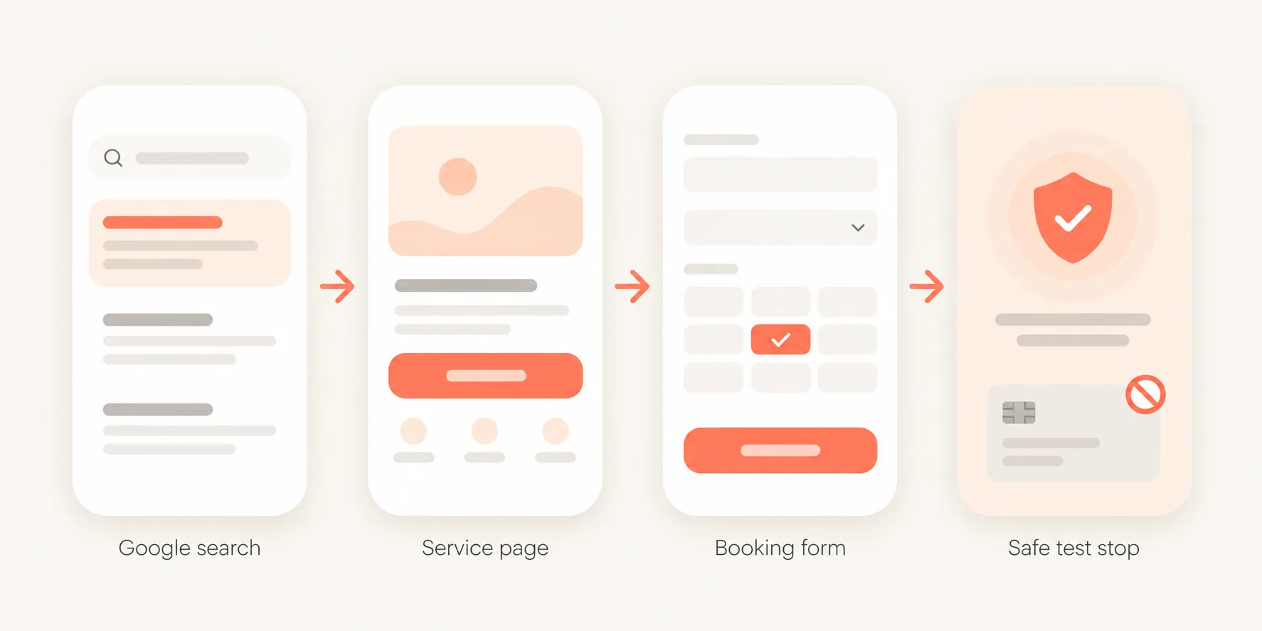
This is a real-device conversion run: follow one important visitor journey from its entry point through to a safe completion state. You are looking for observable friction, not trying to prove why every mobile visitor leaves.

What should a mobile conversion checklist test?
A mobile conversion checklist should test the complete journey: entry, page understanding, scrolling, touch interactions, CTA access, forms or checkout, interruptions, errors and confirmation.
A mobile website audit is not limited to checking whether content fits a narrow viewport. It should reveal where an action becomes blocked, interrupted, unnecessarily costly or unclear on an actual device.
Prepare one realistic mobile journey
Choose one target action: submit an enquiry, book a consultation, start a trial, request a quote, create an account or complete a purchase.
Then define:
- the real entry source;
- the starting page;
- the device and browser;
- the last safe test step;
- non-sensitive test data, if needed.
Use a physical phone for at least one run. If analytics is available, begin with a common device/browser combination for your audience. Do not manually enter the homepage URL if visitors usually arrive through Google, email, ads or social posts.
If the route involves a real payment, order or lead submission, use staging or test mode where possible. Otherwise stop before an irreversible action.
How to Audit a Website for Conversions - choose a priority journey before reviewing it on mobile
Phase 1 — Arrive
Problem 1 - The page loses the promise that brought the visitor here
Open the page through a real search result, ad, social post or email. Check whether the mobile landing page still fulfils the expectation created before the click.
A person searching for an "instant quote" should not land on a general company introduction with the quote path far below the fold. Record the mismatch; do not assume it explains the mobile conversion rate without further evidence.
Problem 2 - Interface layers consume the usable screen
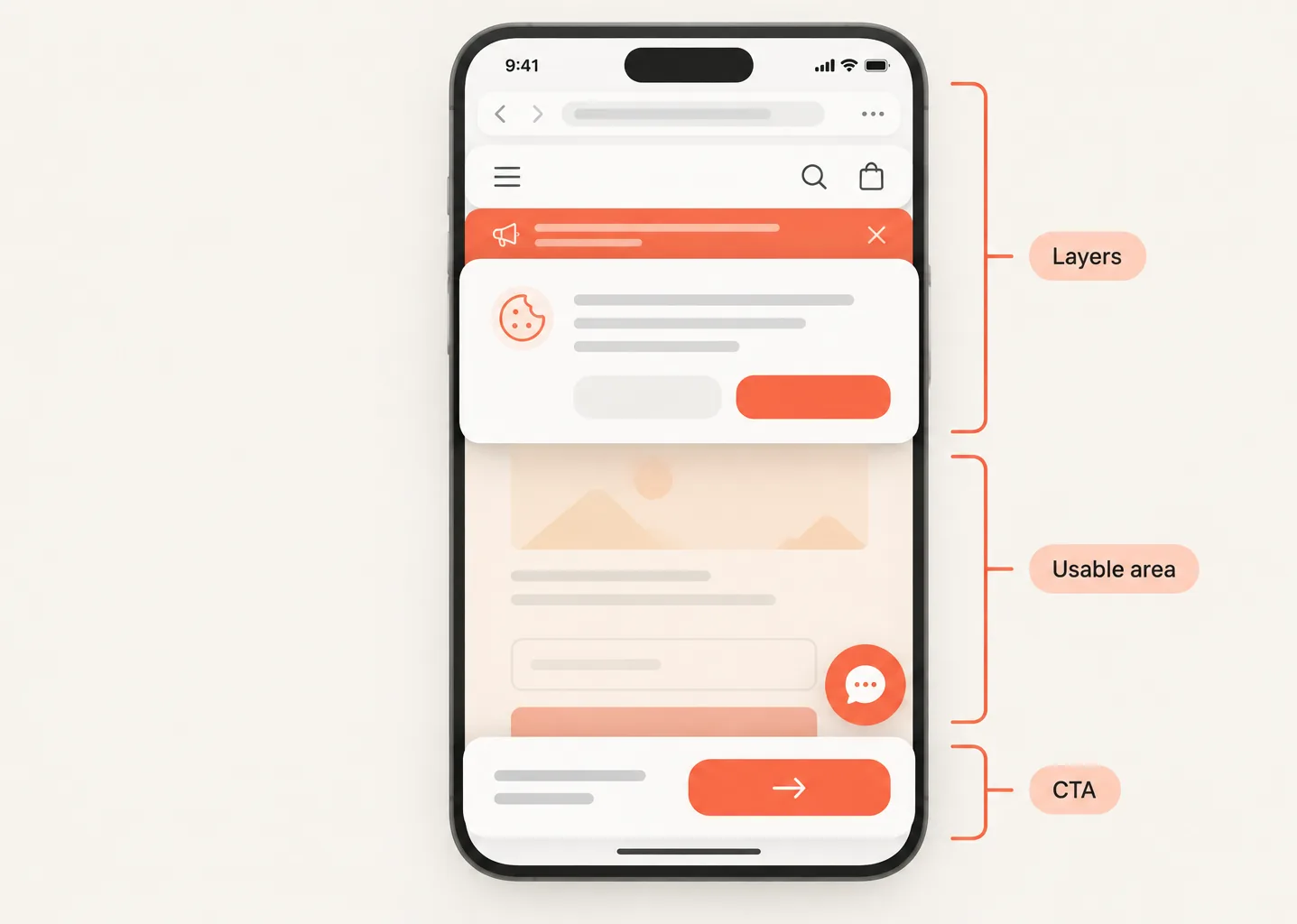
Count what appears at once: browser controls, cookie consent, sticky header, chat widget, app-install prompt, promotional banner and sticky CTA.
On a phone, several individually reasonable elements can leave almost no usable space. Test whether each layer can be closed, whether scrolling still works and whether a CTA or form field becomes obscured.
A mobile menu can also cause this problem. For broader route testing, use the Website Navigation Audit - test whether mobile visitors can still find essential destinations.
Phase 2 — Understand and decide
Problem 3 - Responsive reordering changes the page's meaning
Responsive website testing should check sequence, not only horizontal overflow. When desktop columns stack on mobile, explanations can separate from the evidence, headings can detach from their content and a CTA can appear before the visitor has enough context.
Scroll through the page once without interacting. Ask whether each section still follows logically from the previous one.
Problem 4 - Essential decision information is hard to reach
Find the information needed before action: pricing logic, process, eligibility, delivery area, proof, privacy expectations or what happens next.
It does not all need to appear immediately. It should be discoverable without opening obscure accordions, repeating long scrolls or losing the CTA entirely. Check internal links and anchor links while you are there.
For a local service company, a visitor seeking a quote may need proof, service area and process context before they are ready to contact the business.
Problem 5 - Touch interactions were designed for a cursor
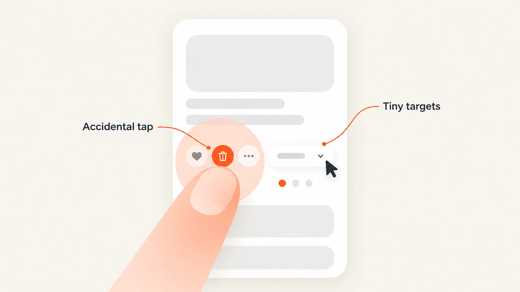
Use one hand where realistic. Notice tightly grouped links, small icons, hover-dependent controls, difficult dropdowns, drag interactions and carousels that fight vertical scrolling.
A control is a mobile usability problem when the visitor cannot confidently activate it, not merely because it differs from desktop. Record accidental taps, controls that close before selection and elements that look interactive but do nothing.
Phase 3 — Act
Problem 6 - The CTA disappears, competes or becomes obstructed
Check the primary action after loading, after reading key information, near the bottom of the page, with the menu open and after closing overlays.
A mobile CTA can fail because a sticky bar covers it, its label is clipped, two actions compete or the layout shifts while the visitor is trying to tap. The relevant question is whether the next action remains understandable and reachable in context.
Website CTA Checklist - review the promise and priority of the action itself
Problem 7 - The interface moves while the visitor is trying to act
Watch for content shifts, banners that arrive late, images changing height, sticky elements resizing or delayed responses after a tap.
These are different problems. A page may load slowly, move unexpectedly or feel unresponsive after interaction. You do not need a technical performance report to record that a button moved just as the visitor tried to use it.
Problem 8 - The keyboard and form fight the visitor
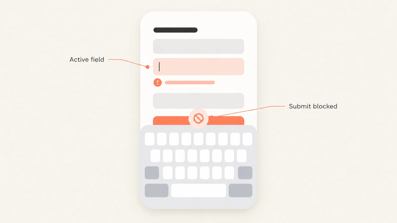
Open one real form, booking flow or mobile checkout. Check the keyboard type, autofill, visible field labels, movement to the next field, submit-button access and validation.
The keyboard should not hide the active field or the only way to continue. A validation error should be visible and fixable without erasing other entries. Do not impose a universal field limit: mobile form UX depends on the value and complexity of the action.
Contact Form Audit - investigate field requirements, labels and validation in more depth.
Phase 4 — Recover and complete
Problem 9 - A small interruption destroys progress
Create one safe interruption. Switch apps and return, lock and unlock the phone, use Back and Forward, change orientation or open a privacy-policy link before returning.
Check whether the visitor remains on the same step, retains entered data and can continue without guessing. A selected service, date or plan should not disappear without explanation.
This test matters because real mobile use includes interruptions that responsive preview cannot reproduce.
Problem 10 - Completion is ambiguous or unmeasured
After a safe completion, look for a clear success state, an explanation of what happens next and protection against accidental repeat submission. If a response time or confirmation email is promised, make sure the visible path reflects that.
Separate two issues:
- User confirmation failure: the action happened, but the person is not sure it worked.
- Measurement failure: the action happened, but analytics or the backend did not record it correctly.
Conversion Path Audit - trace more complex handoffs and completion states.
Record findings in a Mobile Friction Log
Filled example
| Journey step | Device state | What happened | Outcome | Recovery | Evidence | Next action |
|---|---|---|---|---|---|---|
| Quote form | Keyboard open | Sticky CTA covers the submit button | Blocked | Closing the keyboard reveals it | Observed | Fix the stacking order and retest |
One observation on one phone does not prove how widespread a problem is. A reproducible blocker on a valuable journey still deserves prompt attention.
What should you fix first?
Prioritise mobile conversion problems in this order:
- Failed submission, payment, booking or account creation.
- Controls that cannot be reached or activated.
- Data loss and unrecoverable errors.
- Content or actions obscured by overlays, the keyboard or sticky UI.
- Incorrect destinations and broken journey continuity.
- Repeated friction in high-value actions.
- Ambiguous confirmation and tracking failures.
- Secondary visual refinements.
Then consider severity, reproducibility, proximity to the conversion, recovery options and the likely number of affected users or devices. Do not create a numerical mobile score from a single journey.
When the standard checklist is not enough
A deeper mobile website audit is appropriate when results differ substantially between browsers or devices, or the journey includes identity verification, third-party payments, booking tools, file uploads, location permissions, authenticated product states or transitions between a browser and native app.
A lower mobile conversion rate can also reflect traffic intent, context of use or measurement-not only mobile design. Use the real-device run to identify what is observable, then investigate uncertain causes with data.
Why Is My Website Not Converting? - investigate broader causes beyond the tested mobile journey.
Verdict for the tested journey
Usable
The primary route completes without a blocker, lost progress or uncertain outcome.
Needs attention
The route works, but contains repeated friction, unclear actions or awkward recovery.
Critical
The visitor cannot complete the action, essential controls are inaccessible, progress disappears or the success state is missing or unreliable.
Apply this verdict to the tested device and journey-not automatically to the entire website.
FAQ
What is a mobile conversion audit?
It is a real-device review of whether a visitor can understand an offer, interact with the page, complete a key action, recover from interruption and receive clear confirmation.
How do I test mobile conversions on my website?
Choose one important journey, open it through a realistic source on a physical phone, complete it safely and record blockers, interruptions, friction and unclear outcomes in a Mobile Friction Log.
Is responsive design enough for mobile usability?
No. A responsive layout does not guarantee usable touch interactions, keyboard behaviour, overlays, error recovery or confirmation states.
Should I test on a real phone or use browser developer tools?
Use both. Developer tools help compare viewports; a physical phone reveals real touch, keyboard, browser controls and interruption states.
Why is my website not converting on mobile?
The cause may involve traffic intent, source expectations, device constraints, page friction, performance, journey continuity or measurement. A mobile conversion run can identify observable issues, but it does not prove the cause by itself.
Conclusion
Mobile conversion optimization is not a test of whether desktop content fits a smaller screen. It is a test of whether a real person can understand the offer, act with a finger, survive an interruption and know that the action succeeded.
Run one important journey on a real phone. The resulting Mobile Friction Log will give you a clearer first set of fixes than a generic mobile UX checklist.