Hero Section Checklist: 7 Questions Your First Screen Must Answer
A hero section can look polished and still leave a new visitor unsure what the website offers. This hero section checklist focuses on the first screen as a working system: the headline, supporting explanation, visual context, hierarchy and next action should help the right visitor understand enough to continue.
The goal is not to make the hero answer every question or convert every visitor immediately. It should establish meaning, relevance and direction before the visitor scrolls.

What should a hero section accomplish?
A useful first screen helps visitors identify the type of offer, recognise a relevant problem or context, understand the general value and see what they can do next. The required amount of information depends on brand familiarity, offer complexity, traffic source, decision stage and the role of the page.
A hero does not need to list every service, explain the full process or resolve every objection. It also does not need to be the centre of every journey. Some visitors arrive through a service page, product page or campaign landing page instead.
Start with a screenshot, not an opinion
Before changing copy or design, capture the page as visitors encounter it.
- Open the page in a normal desktop viewport.
- Save a screenshot before scrolling.
- Capture the same page on a real phone.
- Temporarily set aside what you already know about the company.
- Ask someone unfamiliar with the business to review the screenshots, if possible.
Record three first impressions:
- What does this appear to offer?
- Who does it appear to be for?
- What would you expect to happen next?
Do not hide the logo or enforce a strict five-second test. The point is to document the information available without deeper research.
Pass one: read the message without the design
Temporarily ignore animation, polish and visual style. Read only the words.
1. Can you identify the offer?
Look for a concrete description of what the business provides: software, consulting, a marketplace, a course, a product or another recognisable category.
A line such as Building a brighter future together may express a mission, but it does not tell visitors whether the company sells finance services, software or sustainability consulting. The supporting copy may clarify the offer, but the combined message should reduce that uncertainty.
Ask:
- Is there a specific noun for the offer?
- Do the headline and supporting text agree?
- Could a new visitor describe the business after reading this section?
2. Can the intended visitor recognise relevance?
Relevance can come from an audience label, a task, a problem, a use case, an industry or a desired outcome. The audience does not always need to appear literally in the headline.
Project management software for construction teams names both category and audience. Keep complex site projects moving uses task and context instead. Either can work if the surrounding text makes the situation recognisable.
Check whether the hero gives a suitable visitor a reason to think, “This may be for me.”
3. Is the promised value specific enough?
A hero should communicate a useful outcome, not just a positive mood. Words such as grow, transform and innovate need an object and context to become meaningful.
Compare:
- Transform your business
- Forecast cash flow across every store before planning the next order
The second statement is not automatically better for every company, but it gives the visitor something concrete to understand. Use the Value Proposition Test for a deeper review of specificity; in this audit, only ask whether the first screen gives enough reason to continue.
If the message fails this pass, a new photograph or brighter button will not solve the underlying problem.
Pass two: inspect the order of attention
Now bring the design back in. The question is not whether the hero looks attractive, but whether visitors notice the right information in a useful sequence.
4. Does the visual explain anything?
A product screenshot, photograph, illustration, diagram, video or even an empty layout can work. The visual should clarify the offer, its context or its outcome, and it should support the words rather than introduce a different story.
A real interface screenshot may explain a SaaS product more effectively than an abstract photograph of a team around a whiteboard. Conversely, a portfolio may need finished work to carry more meaning than a paragraph.
An image is optional. A decorative image that suggests the wrong type of business is not neutral.
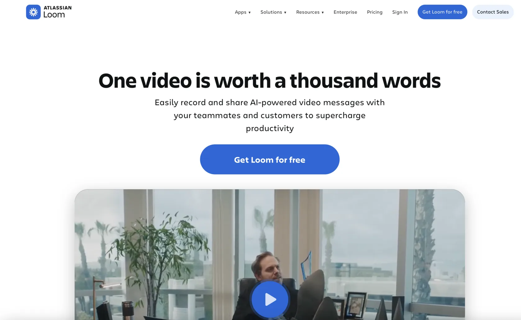
5. Does the hierarchy tell visitors where to look?
Identify the first, second and third visual stops. Can visitors find the headline, supporting explanation and primary action without treating navigation, badges, announcement bars and decorative graphics as equally important?
Do not impose a universal headline size, line count or hero height. A useful hierarchy simply creates a noticeable order.
Try reducing the screenshot to a small size or slightly narrowing your eyes. Which two or three elements remain dominant? This is a quick hierarchy check, not an accessibility test.
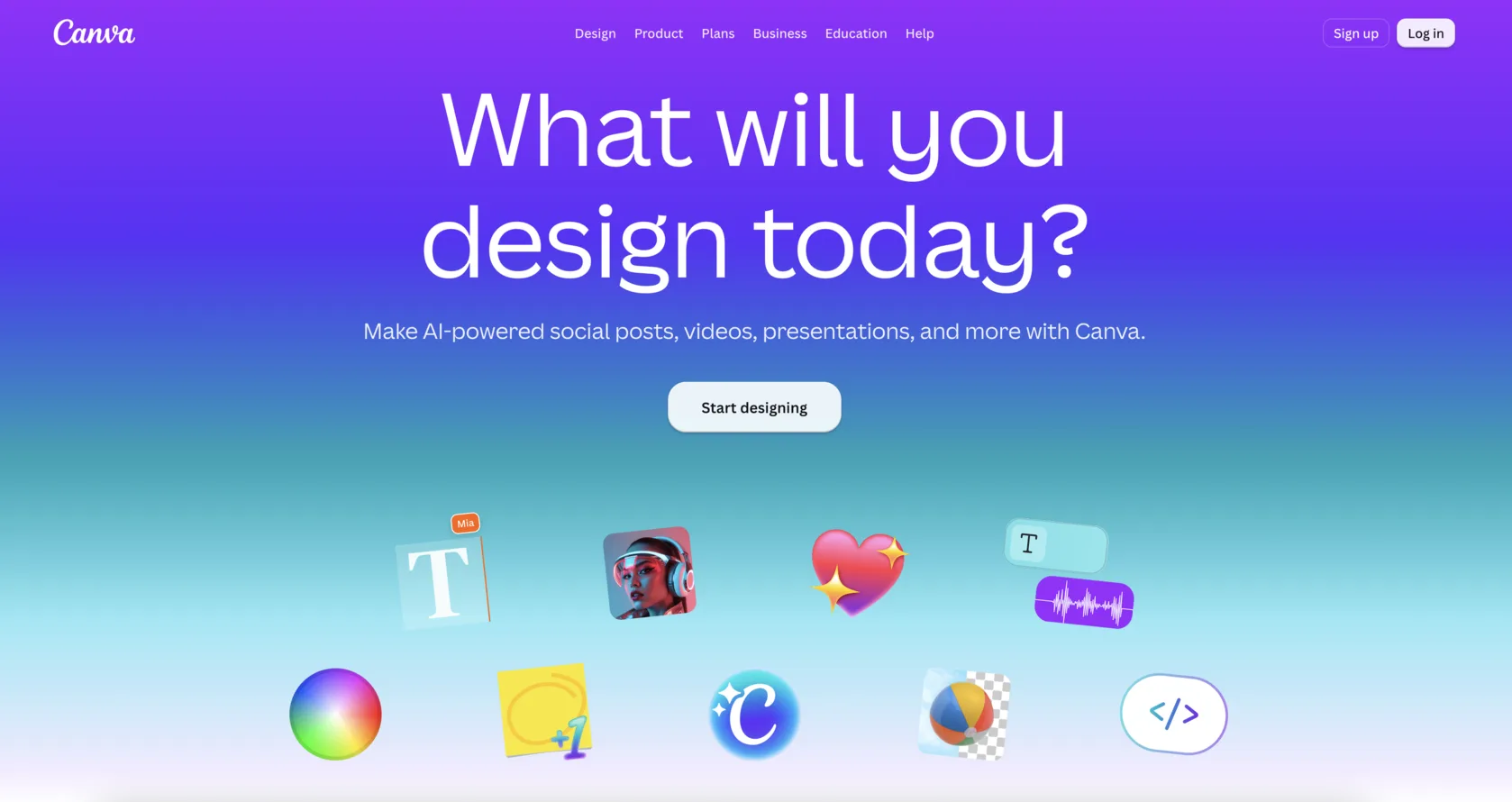
Pass three: follow the implied next step
A hero is also the beginning of an interaction. Test what it promises beyond the first viewport.
6. Is there a sensible next action?
The next action should match both the offer and the page’s role. A product-led SaaS page may invite a trial. A complex service may first direct visitors to explore capabilities or examples. An ecommerce homepage may lead to a category or collection. A campaign page may have one narrow action.
Check:
- Does the action make sense at this point?
- Is the commitment proportionate to the information available?
- Can a visitor who is not ready to buy choose a useful alternative?
- Does the label indicate what will happen next?
A hero does not always need two buttons, and adding another CTA does not automatically improve choice.
7. Does the next screen fulfil the expectation?
Click the main action. Check whether the destination preserves the offer and context established in the hero.
View pricing should not open a generic contact form with no pricing information. A selected product should not disappear into an unrelated catalogue. A booking action should not unexpectedly require a payment or account step without warning.
This test turns the hero from a static design exercise into the first part of a real path.
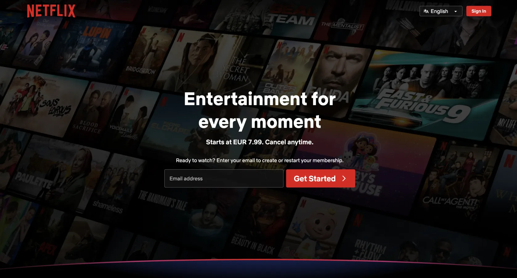
Run the mobile reality check
Use a real phone, not only a responsive preview.
Check whether:
- the offer remains understandable;
- supporting context has not disappeared;
- the visual crop still makes sense;
- a headline wrap has changed the meaning;
- the CTA or logical continuation is available;
- banners and overlays obstruct the screen;
- the hero takes several screens without adding useful information.
Mobile does not have to be a smaller copy of desktop. The layout, crop and amount of secondary content may change, but the central meaning and direction should survive.
The seven-question hero audit card
Answer each question with Clear, Partly clear, Unclear or Not applicable:
Can a new visitor identify what is being offered?
- Clear
- Partly clear
- Unclear
- Not applicable
Can the intended audience recognise a relevant need, task or context?
- Clear
- Partly clear
- Unclear
- Not applicable
Is the promised value specific enough to understand?
- Clear
- Partly clear
- Unclear
- Not applicable
Does the visual clarify rather than distract from the offer?
- Clear
- Partly clear
- Unclear
- Not applicable
Does the hierarchy direct attention to the most important information?
- Clear
- Partly clear
- Unclear
- Not applicable
Is there a sensible and understandable next action?
- Clear
- Partly clear
- Unclear
- Not applicable
Does the next step fulfil the expectation created by the hero?
- Clear
- Partly clear
- Unclear
- Not applicable
Treat the answers diagnostically, not as a score. An Unclear offer or audience signal usually matters more than a minor visual imbalance. An Unclear action or destination can interrupt the journey entirely. Partly clear often means the individual elements work, but do not yet communicate as one system.
Different pages need different heroes
The unfamiliar service
Lead with category context, relevance and a basic expectation of the process.
The known product
A shorter message may be enough when visitors already understand the category and brand.
The visual portfolio
Work samples can carry the main evidence, but visitors still need context about the role, speciality or available action.
The ecommerce homepage
The hero may route visitors to a collection, category or seasonal campaign rather than explain the whole store.
The campaign landing page
Matching the message from the ad or email may matter more than introducing the entire company.
The product-led SaaS page
A product preview and direct trial path may communicate more efficiently than long explanatory copy.
These are patterns, not templates. Judge the hero by the task it must support.
What to change when the hero feels wrong
If the offer is unclear, start with the headline and supporting explanation. If the offer is clear but feels irrelevant, add audience context, a problem or a use case. If the meaning exists but gets lost, rebuild the visual hierarchy. If visitors understand the page but do not know where to go, revise the action and its destination. If desktop works and mobile does not, adapt the composition instead of simply shrinking every element.
A full redesign is not always necessary. One clearer sentence or a better relationship between the existing elements may restore the path.
Your hero does not need to say everything
A strong hero does not complete the entire sale. It creates enough clarity for the right visitor to understand the offer, recognise possible relevance and choose a predictable next step. It may be text-led, visual, minimal or information-rich depending on the page. What matters is agreement between the page context, message, visual emphasis and action. Once that first screen answers the visitor’s immediate questions, the rest of the page can continue the explanation instead of repairing confusion.