Website Navigation Audit: Can Visitors Find What They Need?
Visitors do not arrive with the goal of inspecting a menu. They want to compare services, understand pricing, find proof, check compatibility or contact the right person. A website navigation audit tests whether the site helps them do that without requiring prior knowledge of its structure.
The practical way to audit navigation is to test real visitor missions: predict where a link will lead, follow the route, confirm whether the destination matches the expectation and see whether the visitor can recover after a wrong choice.
What does a website navigation audit check?
A website navigation audit checks whether visitors can find important information, predict the result of a click, understand where they are after moving, and continue without repeatedly returning to the homepage.
It covers more than a header menu. Relevant routes may live in global navigation, local navigation, contextual links, breadcrumb navigation, the footer, utility links, site search and mobile navigation. The goal is not to create a universal website navigation checklist. It is to test website findability for the tasks that matter to this business.
Start with visitor missions, not menu items
Choose four to six tasks that important visitors should be able to complete. Write them from the visitor's point of view-not as page names.
Weak task:
Open the Services page
Useful task:
Determine whether the company solves my type of operational problem
Other useful missions might be:
- compare the available services;
- understand how pricing works;
- find proof from a similar client or industry;
- check whether a product integrates with an existing tool;
- contact the company with a specific question.
If the task already says "click Pricing," the test assumes that the visitor knows where pricing belongs. That hides the very problem you are trying to find.
Choose tasks from different decision stages
Include a mix of tasks related to:
- initial understanding;
- evaluation and comparison;
- risk reduction;
- action.
A local business with one core service will need a different set of missions from a SaaS platform, ecommerce store or documentation-heavy product. The point is to reflect real audience needs, not force every website into the same navigation structure.
Build a Findability Map
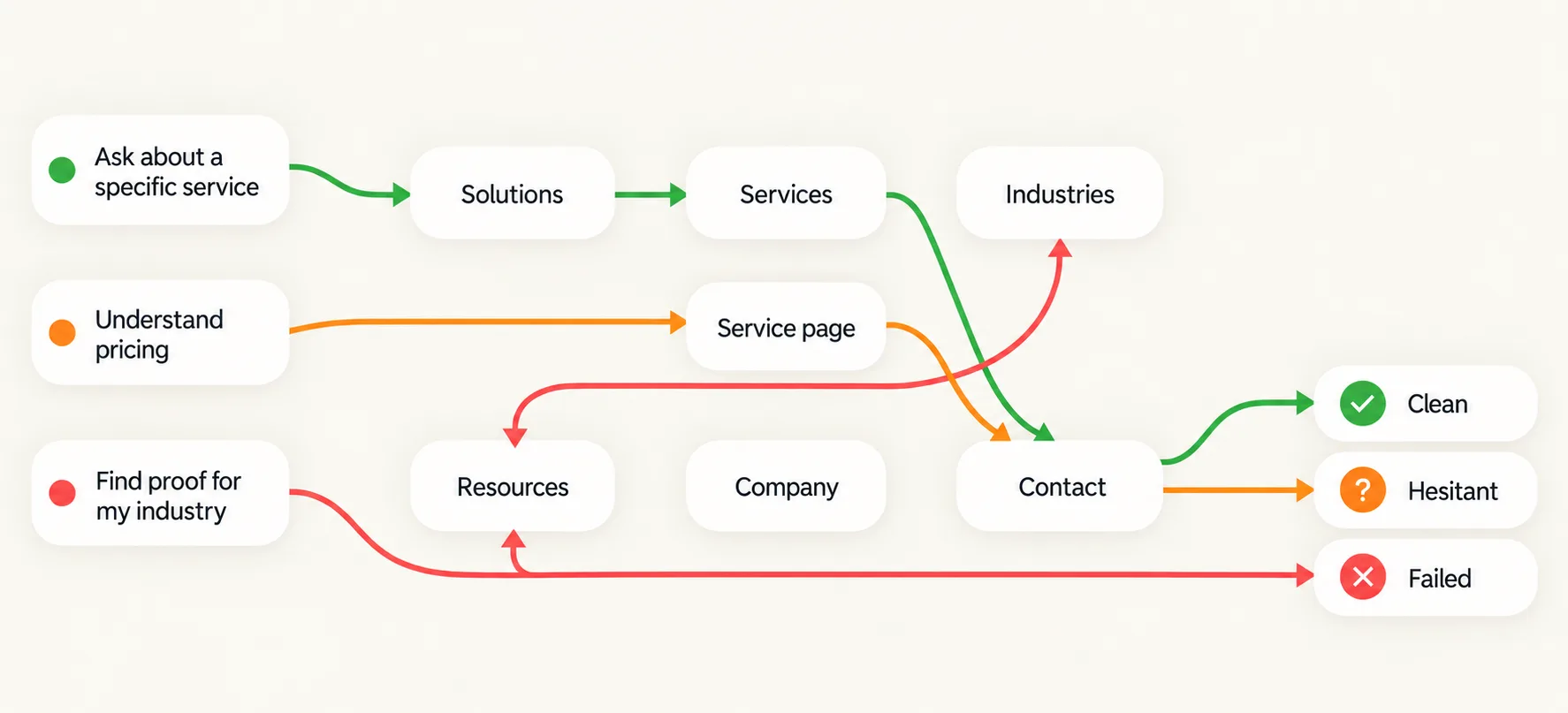
Use one row for each mission. Begin from different pages, not only from the homepage. A useful website menu audit records whether a route was clean, hesitant or failed.
Filled example
Imagine a B2B service website with sections called Solutions, Services, Industries, Resources, Company and Contact.
| Visitor mission | Starting page | Expected route | Actual route | Outcome | Main obstacle |
|---|---|---|---|---|---|
| Understand pricing | Service page | Pricing details or service-specific context | Only a generic Contact link is visible | Hesitant | No predictable route to pricing information |
| Find proof for my industry | Industry page | Relevant case study or client example | Resources opens a broad article library | Failed | The label does not lead to industry-specific evidence |
| Compare services | Blog article | Services overview with clear differences | Solutions opens a company story | Failed | "Solutions" and "Services" suggest overlapping destinations |
| Ask about a specific service | Case study | Enquiry route that preserves the service context | Generic Contact page | Hesitant | The visitor must reconstruct the topic of their enquiry |
Clean means the next step is understandable and the destination confirms the choice.
Hesitant means the path works but requires guesswork, backtracking or checking several options.
Failed means the visitor cannot confidently find the needed information or reaches an unexpected destination.
Test 1 - Predict the destination before you click
For every mission, pause before choosing a link and answer:
What do I expect to find after selecting this label?
Then check whether the destination fulfils that promise.
Look for:
- a headline that confirms the choice;
- familiar terminology between the label and page;
- a destination that is specific enough for the task;
- labels that do not combine unrelated meanings.
Words such as Solutions, Discover, Resources or Platform are not inherently poor navigation labels. Their usefulness depends on the audience and the destination. If a visitor looking for a specific service selects Solutions but reaches a company-history page, the link works technically while its information scent is weak.
Record the mismatch as an observation. Do not assume it caused a measurable business outcome without further evidence.
Test 2 - Enter through a page that is not the homepage
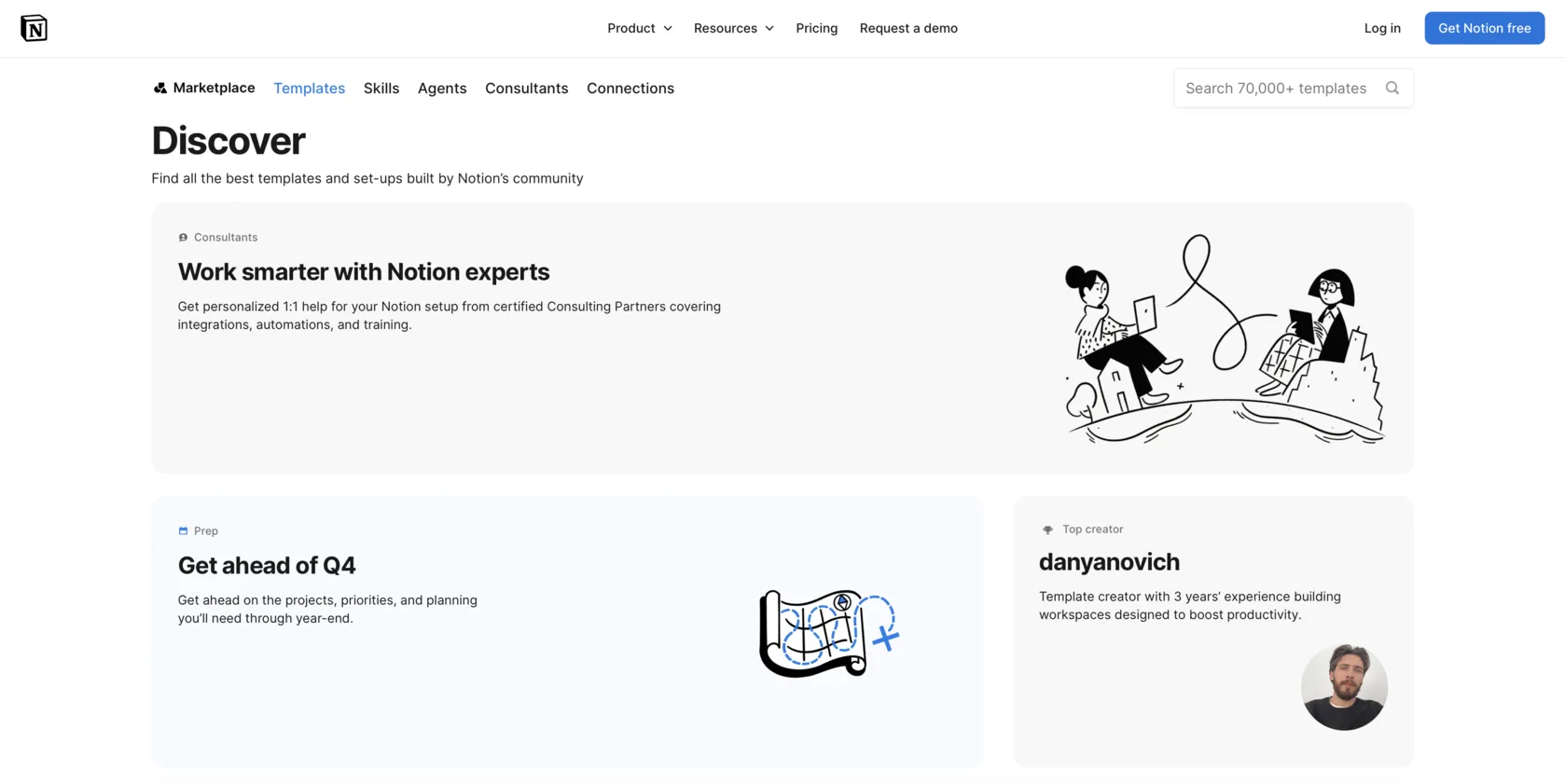
Visitors can arrive directly on an article, service page, product page, case study, pricing page or campaign landing page. Open one important internal page in a private window and try to complete a mission from there.
Ask:
- Can I tell what section of the site I am in?
- Can I find the company's core offer?
- Can I move to a related page without starting over?
- Is there a clear next step after this page?
- Does the current-page state, local navigation or breadcrumb help me orient myself?
Navigation should support people entering through many doors, not only those who begin at the homepage. If an industry page has no route to a relevant service, proof or contact path, it may be valuable for search but weak as an independent entry point.
Homepage Audit Checklist - review the homepage's role without treating it as every visitor's starting point.
Test 3 - Take a wrong turn and try to recover
Choose a plausible but incorrect option. On the example website, a visitor may reasonably select Solutions instead of Services.
After arriving, check whether the page helps them recover:
- Is it clear where they are?
- Is global navigation still available?
- Can they reach a neighbouring relevant section?
- Do contextual links or breadcrumbs offer a useful correction?
- Does the page end in a dead end?
Good navigation does not assume that every visitor chooses correctly on the first attempt. It gives them enough orientation to repair a mistake without restarting the journey.
The same principle applies to 404 pages and empty search results: they are edge states, but they should still offer a route back to something useful.
Test 4 - Check whether the page continues the journey
Finding the right page is not the end of navigation. Once a visitor has read it, they may need to compare an option, see evidence, explore a related topic or begin an appropriate action.
Keep three route types distinct:
- Global navigation gives access to major areas across the site.
- Contextual navigation connects the current page to relevant next information.
- Conversion actions invite a commercial or high-commitment step.
A case study might link to the relevant service and related industry page before presenting a contact CTA. Sending every visitor directly to a generic contact page can remove useful decision paths for people who are not ready.
Website CTA Checklist - assess commercial actions separately from navigation links.
Conversion Path Audit - follow the journey after a visitor begins a key action.

Test 5 - Compress the experience to mobile
Repeat the two most important missions on a real phone. This is not a full mobile usability audit; it is a parity test.
Check whether:
- the same key destinations remain available;
- important submenu items have not disappeared;
- open, closed and current states are understandable;
- labels and hierarchy remain intact;
- links are practical to tap;
- the menu can be closed without trapping the visitor;
- a long menu still communicates its structure.
A hamburger menu is not automatically good or bad. The question is whether mobile navigation preserves the routes that matter on desktop.
Diagnose the pattern, not just the individual link
One unclear link can be a local wording issue. Several failed routes often point to a deeper problem in website information architecture.
| Observed symptom | Likely problem type | What to inspect next |
|---|---|---|
| The visitor does not know which option to choose | Label problem | Terminology and differences between options |
| A click opens an unexpected page | Scent problem | Label, destination headline and page content |
| A needed page is reachable only through the homepage | Structural problem | Routes from internal entry pages |
| The visitor cannot tell where they are | Orientation problem | Current-page state, headings, breadcrumbs and local navigation |
| A correct page offers no useful continuation | Continuity problem | Contextual links and next information |
| A desktop route disappears on mobile | Implementation or parity problem | Mobile menu and responsive states |
| Several missions lead to the same generic page | Architecture problem | Separation of destinations by visitor intent |
What should you fix first?
Prioritise route problems by the importance of the mission, the number of affected entry pages, how often the pattern repeats and how confidently you can reproduce it.
Start with:
- Broken, inaccessible or missing routes.
- Failed routes for commercially important missions.
- Labels that repeatedly lead to unexpected destinations.
- Dead ends and pages with no meaningful continuation.
- Mobile and desktop navigation inconsistencies.
- Orientation problems across a group of pages.
- Minor wording or visual refinements.
Do not begin with a full menu redesign if a clearer label, contextual link or destination headline resolves the actual problem.
When conventional navigation rules may not apply
There is no universal number of menu items, clicks or dropdown levels that makes navigation usable.
A one-page site may depend on section links rather than a large header. An ecommerce store may need a deep category structure. A knowledge base may rely on search. A campaign landing page can have intentionally limited navigation. A marketplace or authenticated product may need different routes for different roles.
Not every page belongs in main navigation. Some pages are easier to find through contextual links, local navigation, footer links or search. The test is whether the intended visitor can choose with confidence and make visible progress toward their task.
Your navigation audit verdict
Clear
Key missions complete without mistaken turns. Labels are predictable, internal pages preserve orientation and mobile retains important routes.
Needs attention
Visitors can complete most missions, but some routes require guesswork, returns to the homepage or familiarity with internal company terminology.
Critical
Important information cannot be found, routes break, mobile navigation loses essential destinations or visitors regularly land somewhere different from what they expected.
Base the verdict on the Findability Map, not on whether the menu looks visually tidy.

FAQ
What is a website navigation audit?
It is a task-based review of whether visitors can find important information, predict destinations, stay oriented and continue to the next relevant step across a website.
How many items should a website menu have?
There is no universal number. The right amount depends on how distinct the options are, the complexity of the site and what key audiences need to find.
Should every page appear in the main navigation?
No. Main navigation should represent important destinations and categories. Other pages may be easier to discover through contextual links, local navigation, search or the footer.
How can I test website navigation without users?
Run a task-based expert review with realistic missions and starting pages. It does not replace user testing, but it can reveal obvious route, label and orientation problems.
Is the three-click rule still useful?
Not as a universal rule. More important than the number of clicks is whether each choice is understandable and visibly moves the visitor toward their goal.
Conclusion
A navigation audit should answer more than "Is the menu clear?" It should show whether different visitors can find what they came for, confirm they chose the right route, recover from mistakes and continue after reaching a relevant page.
Test tasks, not menu items. The Findability Map will show whether individual fixes are enough-or whether the site navigation needs a more structural rethink.