How to Audit a Website for Conversions in 30 Minutes
Thirty minutes is not enough to explain every conversion problem on a website. It is enough to test one important visitor journey, find visible gaps and decide what deserves attention next.
To audit a website for conversions, choose one target action, begin from a realistic entry point, check whether the page fulfils the visitor’s expectation, then follow the action through to a safe completion point. Record what you can observe, separate it from assumptions and leave with a short list of actions—not twenty loosely connected CRO comments.
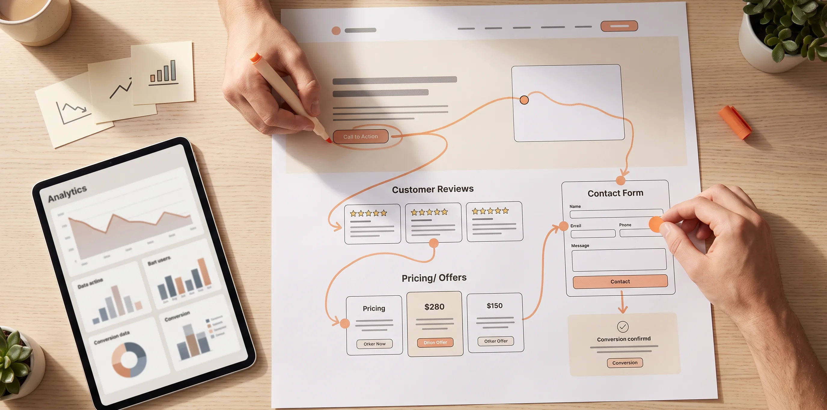
What a 30-minute conversion audit can—and cannot—tell you
This is a triage session, not a full website conversion audit.
In half an hour, you can identify visible blockers, missing decision information, broken handoffs and uncertainty within one meaningful path. You can also form initial hypotheses and decide what to fix, measure or investigate.
You cannot prove why every visitor leaves, evaluate the entire site, replace analytics or user research, or predict the conversion-rate impact of a future change. A CRO audit checklist becomes misleading when it treats every observation as a proven cause.
Set up the audit before starting the timer
Choose one conversion. “Does the site convert well?” is too broad to test. Use an observable action instead:
- submit an enquiry;
- book a consultation;
- start a trial;
- request pricing;
- create an account;
- complete a purchase.
Then define one realistic route:
- Entry page
- where does this visitor arrive?
- Completion
- what does successful completion visibly look like?
- Device
- is desktop or mobile more relevant to this route?
- Source
- what likely created their expectation—Google, an ad, a referral or an email?
Open the route in a private window, keep notes nearby and start with the source page or search result rather than automatically beginning on the homepage. Use analytics only if it is already available; do not spend the session setting up tools.
Throughout this article, imagine a potential client who finds a B2B consulting service through Google, lands on its service page and tries to book a free consultation.
The 30-minute conversion audit at a glance
| Time | Task | Result |
|---|---|---|
| 0–5 min | Recreate the entry expectation | A recorded message-match gap, or confirmation that the match holds |
| 5–10 min | Explain the page in plain language | Clear statements, assumptions and unsupported claims |
| 10–15 min | Look for missing decision information | A short list of unanswered questions |
| 15–20 min | Follow the route to the main action | CTA and hierarchy observations |
| 20–26 min | Attempt safe completion | Path, form and confirmation observations |
| 26–30 min | Sort the findings | One to three priority actions or research questions |
Minutes 0–5: Recreate the visitor’s expectation
Start with what happened before the page loaded. Compare the source, the landing-page headline, the offer and the next action.
Complete these two sentences without improving the website's language:
Before the click, I expected...
After landing, the page asks me to...
For example, a Google result may promise a “free operations assessment,” while the page immediately asks the visitor to “Book a sales call.” That does not automatically make the page ineffective, but it is an expectation gap worth recording. The visitor may have expected an assessment before committing to a sales conversation.
Do not turn this into a campaign review. You are checking whether the selected page continues the promise that brought the visitor there.
Website Traffic but No Leads — distinguish traffic issues from page-level expectation gaps

Minutes 5–10: Explain the page without borrowing its language
Now do a short translation exercise. Do not reuse words from the headline, labels or service cards. In your own words, answer:
- What is being offered?
- Who is it for?
- What outcome does it help create?
- Why might someone choose it over an alternative?
- What should they do next?
If the answers rely on words such as innovative, seamless, solutions or empower, the page may be creating atmosphere without supplying enough meaning.
| Directly clear | Inferred by you | Still unproven |
|---|---|---|
| “The company offers operational consulting” | “It may suit mid-sized manufacturers” | “It has delivered measurable savings” |
This is a practical impression test, not a five-second rule. A complex offer may need more than one section to become clear. The point is to see whether the page gives visitors usable information or asks them to fill the gaps themselves.
Minutes 10–15: Look at the decision from the visitor’s side
Stop reading as the business owner for a moment. Imagine that you are about to give this company your time, money or contact details.
Is this relevant to my situation?
Can you recognise a use case, audience, constraint or expected outcome? The B2B consulting page may mention “growth-minded teams” but never explain which operational problem it solves.
Why should I believe this?
Look for proof that matches the important claim: a demonstration, specific case evidence, credible testimonial, work sample or a transparent explanation of the process. A testimonial about friendly communication does not substantiate a promise of cost reduction.
What risk am I accepting?
Consider the commitment created by the next step. Is the price or pricing model understandable where relevant? Is it clear what happens after a booking, how data will be used, whether a call is exploratory or sales-led, and whether cancellation or eligibility conditions apply?
Not every page needs every answer. A question matters most when it is likely to arise immediately before the target action.
Website Trust Signals — assess whether important claims have relevant support
Minutes 15–20: Follow the visual and verbal path to action
Do not review the button in isolation. Read the surrounding section, then ask:
- Can you identify the primary action without searching?
- Does the action fit the amount of information provided so far?
- Does the wording explain what happens next?
- Are several equally prominent actions competing?
- Is the information needed to decide available nearby?
A quick way to reveal weak hierarchy: zoom out or cover most body copy with your hand. You should still be able to distinguish the main action from lower-priority options. This is not a design test; it is a way to notice when every button competes for the same attention.
In the running example, Get started says little about whether the visitor will book a call, receive an assessment or enter a sales process. Record the uncertainty rather than assuming it lowers bookings.
Website CTA Checklist — review CTA wording, hierarchy and destination expectations

Minutes 20–26: Complete the action like a real visitor
Select the CTA and follow the route to the last safe step. Do not create a real order, payment, booking or unwanted enquiry. Use test mode, staging or your own clearly labelled test data where a safe procedure exists.
Watch for changes that a page-only review can miss:
- Does the destination match the CTA promise?
- Is the selected service or offer preserved?
- Do unexpected requirements appear?
- Does the form request information before explaining why it is needed?
- Can you correct an error without losing progress?
- Does the confirmation clearly state what was completed and what happens next?
A conversion failure means the visitor cannot complete the intended action. A measurement failure means the action succeeds but analytics does not record it. They require different fixes.
If the route matters on mobile, repeat this one path on a real phone. You do not need a full mobile audit to notice an obstructed calendar, hidden field or unusable form control.
Contact Form Audit — inspect form fields, validation and recovery
Conversion Path Audit — trace complex journeys beyond this 30-minute review
Minutes 26–30: Turn observations into decisions
Classify your notes before deciding what to change.
| Category | Meaning | Example |
|---|---|---|
| Blocker | Prevents completion | The booking form will not submit |
| Expectation gap | The experience differs from the earlier promise | “Instant quote” opens a generic sales form |
| Decision gap | Important information is missing | The visitor cannot tell what the consultation includes |
| Friction | Completion is possible but needlessly difficult | The form asks again for a selected service |
| Measurement gap | Results cannot be evaluated reliably | The thank-you event is not tracked |
| Hypothesis | A possible explanation that needs evidence | Visitors may not notice the secondary CTA |
Then ask three questions of each finding:
- How close is it to the target action?
- How many important visitors or pages could it affect?
- Is it directly observed, supported by data or still a hypothesis?
End the session with only three outputs:
- one reproducible blocker to fix immediately;
- one high-priority gap to improve;
- one question to validate with analytics, customer evidence or further testing.
That is more useful than a long list of unranked website conversion issues.
Use this 30-minute conversion audit sheet
Filled example
| Time | Page or step | What I observed | Category | Evidence | Next action |
|---|---|---|---|---|---|
| 0–5 | Google result → consulting service page | The result promises a free operations assessment; the page immediately offers a sales call. | Expectation gap | Observed | Align the landing-page message with the result, or clarify the assessment-to-call process. |
Copyable blank template
| Time | Page or step | What I observed | Category | Evidence | Next action |
|---|---|---|---|---|---|
| 0–5 | Entry expectation | Observed / Data-backed / Hypothesis | |||
| 5–10 | Understanding | Observed / Data-backed / Hypothesis | |||
| 10–15 | Decision information | Observed / Data-backed / Hypothesis | |||
| 15–20 | CTA and action | Observed / Data-backed / Hypothesis | |||
| 20–26 | Completion | Observed / Data-backed / Hypothesis |
What to do after the timer stops
Fix reproducible blockers first. Confirm measurement before drawing conclusions about performance. Then group repeated findings across similar pages and use behavioural data or user feedback to investigate uncertain hypotheses.
A deeper review is appropriate when the same issue appears in several journeys, tracking is unreliable, visitors move between devices or roles, different traffic sources create different expectations, or a visual review cannot explain weak results.
Why Is My Website Not Converting? — investigate broader causes beyond one conversion journey
Conclusion: turn a vague concern into a testable next step
Thirty minutes will not diagnose every reason a website underperforms. It can replace vague opinions with one real path, reproducible observations and a small set of better next actions.
Run the same route again after a change. If the path becomes clearer, more coherent and easier to complete, you have a stronger basis for the next round of website conversion optimization.
FAQ
What should a website conversion audit include?
It should review entry expectations, offer clarity, decision information, trust, CTA relevance, safe path completion, technical blockers and measurement of the intended action.
Can I audit a website for conversions without analytics?
Yes. You can identify observable problems and form hypotheses. Without data, you cannot reliably measure how often a problem occurs or prove its effect on conversion rate.
Which page should I audit first?
Start with a page involved in an important conversion and receiving meaningful, relevant traffic. It does not have to be the homepage.
How often should I run a conversion audit?
Repeat it after meaningful changes to the offer, page, form, traffic source or booking process—and whenever results no longer match expectations.